.NET License Keys — New in v25.1
This new release requires every developer/build machine to store a DevExpress license key associated with your account.
DevExpress Unified Installer (Windows) automatically obtains your License Key and places it into its correct location. Run the installer in Repair/Register mode to update your key when necessary. If you used our Unified Installer before license keys were introduced (prior to v25.1), you should not experience any changes when installing or updating DevExpress products.
If you bypass the DevExpress Unified Installer, you can download your license key and register it in the system manually (via a file on disk or an environment variable). Review detailed instructions in the following help topic: Online NuGet Feeds, CI/CD, and Other Installation Methods (Windows, macOS, Linux).
If using DevExtreme (React, Angular, Vue, JS), please refer to the following DevExtreme-specific licensing help topic: DevExtreme Licensing.
Accessibility (A11Y)
In v25.1, we expanded our accessibility support to include more UI controls and platforms:
Your feedback matters.
Please, review the description of AI-related features below and leave your feedback at the end of the section.
Go to the survey now.
New AI-powered Extensions
NOTE: DevExpress does not offer a REST API or ship any built-in LLMs/SLMs. Instead, we follow the BYOL ("bring your own license") principle. To use these features, you need to have an active subscription to AI services (e.g., Azure, Open AI, Google Gemini, Mistral AI, etc.) and obtain the REST API endpoint, key, and model deployment name. These variables must be specified at runtime to enable DevExpress AI-powered Extensions in your application.
#New Semantic Search (WinForms & WPF)
Semantic Search enhances query relevance using Natural Language Processing (NLP). Instead of matching exact keywords, this feature transforms input into vector embeddings and uses a similarity algorithm to return contextually appropriate results.
#New WPF Smart Search
Our WPF Ribbon and Accordion controls now support AI-enhanced search. When users pause data input, the control sends an AI request designed to evaluate context, synonyms, and user intent. Returned results are integrated into the existing search flow.
Learn more
#New WPF Smart Paste
Smart Paste (AI-powered) transforms traditional copy-and-paste operations – making it smarter and more efficient. SmartPaste analyzes content and intelligently assigns correct values to appropriate fields or row cells within our WPF Data Grid and Layout Control.
Learn more

#HTML Editor AI Assistant
The DevExpress JavaScript & ASP.NET Core HTML Editor supports AI-driven text transformations, including rewriting, summarizing, translating, and tone/style changes for selected content.
Learn more
#Inline Report Translation
With v25.1, DevExpress Report Viewer components (WinForms, WPF, Web) support inline translation. Users can translate selected content into a specified language directly in the document preview window.
Learn more
#VCL Rich Edit Text Editor and Memo AI Assistant
Our VCL Rich Edit Text Editor and Memo components now include Summary, Translation, and other AI-powered functions.
Learn more
AI Chat Control
#Enhancements — All Supported Platforms
AI Chat Controls for Blazor, WinForms, and WPF have been updated with the following features/capabilities:
- File Attachments: Users can attach files for AI analysis.
- Prompt Suggestions: Predefined hints to assist user queries.
- Stop Message Generation: Interrupts long-running AI replies.
- OpenAI Assistant Reuse: Updated API allows reuse of existing assistants.
Learn more
#WPF AI Chat Control
v25.1 introduces a new WPF AI Chat Control that leverages BlazorWebView and reuses the DevExpress Blazor AI Chat component.
Learn more
AI-powered End-User Report Designer
DevExpress WinForms and Web Report Designers now support the following AI-powered features:
Localization
Automatically translate all localizable property values to the selected language.
Auto-Generate Data for Print Preview
Preview reports with AI-generated sample data before connecting to a live data source.
Natural Language to Expressions
Convert plain-text descriptions to expressions and filter criteria.
Report Wizard AI Assistant
DevExpress Report Wizard v25.1 adds an AI Assistant with predefined prompt suggestions. Users can create reports based on text descriptions.
Report Modification
Users can create or modify report elements using the integrated AI Assistant. This feature is available for projects that target .NET 8+.
Learn more
AI Demo Center
To explore all AI-powered features included in our most recent major update (v25.1+), please navigate to our AI-powered Demo Center page.

AI Integration - Prerequisites
DevExpress.AIIntegration References Stable Versions of Microsoft AI Packages
DevExpress.AIIntegration assemblies now reference stable versions of Microsoft.Extensions.AI.* NuGet packages:
| Package Name | v24.2.8+ and v25.1.3+ | Previous Versions |
Microsoft.Extensions.AI
| 9.5.0 | 9.4.3-preview.1.25230.7 |
Microsoft.Extensions.AI.Abstractions
| 9.5.0 | 9.4.3-preview.1.25230.7 |
Microsoft.Extensions.AI.OpenAI
| 9.5.0-preview.1.25265.7 | 9.4.3-preview.1.25230.7 |
Azure.AI.OpenAI
| 2.2.0-beta.4 | 2.2.0-beta.1 |
OpenAI
| 2.2.0-beta.4 | 2.2.0-beta.1 |
To ensure compatibility with the new stable version:
- Open your .csproj file.
-
Update all references to the following packages:
Microsoft.Extensions.AI.Abstractions → 9.5.0
Microsoft.Extensions.AI → 9.5.0
Microsoft.Extensions.AI.OpenAI → 9.5.0-preview.1.25265.7
- Restore packages and rebuild your solution.
See the following breaking change advisory for more information: DevExpress.AIIntegration references stable versions of Microsoft AI packages.
Survey - AI-powered Extensions
Your Feedback Matters!
Please
login to complete the survey.
Survey Completed
Thank you for taking the time to complete this survey. Your responses have now been posted. If you want to follow up with additional information, feel free to send us an email at clientservices@devexpress.com anytime.
You've Already Completed This Survey
Our records show that you have already completed this survey. If you want to follow up with additional information, send us an email at clientservices@devexpress.com.
This survey has expired
If you want to share your feedback or request new functionality, please submit a new support ticket via the DevExpress Support Center. We’ll be happy to follow up.
Your feedback matters.
Please, review the description of WinForms-related features below and leave your feedback at the end of the section.
Go to the survey now.
AI-driven Semantic Search
Our WinForms Data Grid, GridLookUpEdit, and SearchLookUpEdit controls ship with an enhanced search experience and allow users to locate relevant data within large datasets faster/more accurately. Unlike standard keyword-based search, semantic search leverages Natural Language Processing (NLP) to analyze search queries beyond exact keyword matching.
Semantic search uses an embedding generator to convert text into numerical vector representations. Vector embeddings are stored in a vector store (for example, a database, in-memory collection, or a custom implementation that stores vector values in files). When a user enters a search query, the search engine computes similarity scores between the query vector and stored data vectors to return the most relevant results.
Once AI-driven semantic search is enabled, a dropdown button appears within the search box. The popup menu allows users to specify search mode:
- Standard - traditional keyword-based search.
- Semantic - vector-based semantic search to find conceptually similar items.
- Hybrid - a combination of standard and semantic search.

Semantic search can operate in two modes:
- Filter Mode - Displays only matching records.
- Search Mode - Highlights relevant data rows for more intuitive data discovery.
To enable semantic search within the WinForms Data Grid or Data Lookup control, you must register an embedding generator, supply a vector storage/database, connect our new SemanticSearchBehavior to the grid or lookup control, and configure behavior settings (such as, an embedding generator, vector store, record type in a vector store, data source key field, search mode, search accuracy, the maximum number of results, etc.).
Documentation
Template Kit
#WinForms Application Builder
Building a modular/multi-view WinForms application from scratch requires significant setup effort — from selecting an optimal navigation model to integrating appropriate UI components. Our new Application Builder template automates these foundational steps, allowing developers to focus on business logic and user experience rather than boilerplate code.
The DevExpress WinForms Application Builder uses a straightforward, 2-step interactive wizard:
Step 1: Select a Navigation Model
Specify the desired navigation structure for your project:
- Accordion
- Tabbed Accordion
- Compact List
- Tabbed Window
Step 2: Select DevExpress Controls
Select pre-configured DevExpress UI controls based on project requirements.
Based on your selection(s), the template automatically generates an application with:
- A fully configured navigation system.
- Separate views for each selected UI control.
#New 'Middle-Tier Security Application' Project Template
With this project template, you can quickly build a high-performance WinForms application and connect it to an ASP.NET Core Middle-Tier Server. This template is based on a fully functional example app and is designed for those interested in a secure/scalable solution powered by .NET 8+.
As you would expect, the template is engineered to minimize setup complexity. With it you can:
- Build a data model for application business entities and security policies with EF Core.
- Connect a Windows Forms .NET 8 client application to a backend using the DevExpress ASP.NET Core Middle-Tier Security Server.
- Define access permissions and activate authentication/authorization for a .NET 8 WinForms application.
- Customize the UI/UX based on user-specific access permissions.
- Create a login form to authenticate users.
- Create an edit form to modify and post data (CRUD).
Documentation Example (GitHub)
#New DevExpress Item Templates
Template Kit v25.1 allows you to add the following DevExpress-powered UI elements/controls to your .NET 8+ WinForms project:
DevExpress Forms:
- Form (XtraForm)
- DirectX Form
- Fluent Design Form
- Modular Form
- Ribbon Form
- Splash Screen
- Tabbed MDI Form
- Toolbar Form
- Wait Form
- Wizard Form
DevExpress User Controls:
- User Control
- Modular User Control
Additional Templates:
- Dashboard
- Custom Data Editor
- Custom Data Grid
Accessibility
#Mnemonic-Based Submenu Navigation
With v25.1, we enhanced keyboard accessibility for traditional Toolbar-based user interfaces. Users can cycle through submenu items with the same mnemonic (denoted by & in captions). When multiple items within a submenu have identical mnemonics, repeated key presses navigate through them sequentially. The feature is automatically enabled and does not require additional configuration.
barItemSaveAs.Caption = "Save &As";
barItemSaveAll.Caption = "Save &All";
#Accordion Shortcuts
Accordion items now support keyboard shortcuts. Use the ShortcutKey property to specify a predefined or custom keyboard shortcut. This enhancement improves accessibility, especially for applications with complex navigation structures.
accordionControlElement1.ShortcutKey = new DevExpress.XtraBars.BarShortcut(Keys.J);
#BarItem - Support for AutomationId
The AutomationIdBarItemName
JSON Serialization
DevExpress WinForms UI controls now support JSON-based layout serialization - an alternative to XML for simplified integration with modern web and AI services. With v25.1, new SaveLayoutToJson(Stream)RestoreLayoutFromJson(Stream)
string filePath = "gridlayout.json";
void Form1_Load(object sender, EventArgs e) {
    if (File.Exists(filePath)) {
        using (var jsonStream = File.OpenRead(filePath))
            gridView1.RestoreLayoutFromJson(jsonStream);
    }
}

void Form1_FormClosing(object sender, FormClosingEventArgs e) {
    using (var jsonStream = File.OpenWrite(filePath))
        gridView1.SaveLayoutToJson(jsonStream);
}
JSON serialization is available for projects targeting .NET 8+ and .NET Framework 4.6.2+.
Rounded Skin Panel
Now Available in the Visual Studio Toolbox
Our RoundedSkinPanel control is fully integrated into the Visual Studio designer and can be added to your form at design time directly from the Toolbox.
Unlike standard panels, our RoundedSkinPanel automatically renders rounded corners and padding around individual UI elements (GridControl, TreeList, RichEditControl, etc.) whenever the WXI skin is used. For other DevExpress Skins, RoundedSkinPanel falls back to a standard rectangular border without extra padding.
Documentation

// Create a TreeList.
TreeList treeList = new TreeList() { Dock = DockStyle.Fill };
// Create a RoundedSkinPanel and set it to fill the form.
roundedSkinPanel = new RoundedSkinPanel() { Dock = DockStyle.Fill };
// Add the TreeList to the panel.
roundedSkinPanel.Controls.Add(treeList);
// Add the panel to the form.
this.Controls.Add(roundedSkinPanel);
Important
The RoundedSkinPanel is designed to host a single UI control. If you attempt to add more than one, a warning will appear at design time. For complex layouts/UI requirements, simply nest multiple RoundedSkinPanel
Outlook-inspired Side Navigation
We added new properties to our WinForms RibbonForm to replicate the side navigation layout of Microsoft Outlook for Windows.

The NavigationControl property specifies the navigation control as a side navigation element (such as an AccordionControl, NavigationPane, or ToolboxControl). The NavigationControlLayoutMode property aligns the side navigation relative to the form's title. Alignment options include:
StretchToFormTitle
StretchToTop
using DevExpress.XtraBars.Ribbon;

public partial class Form1 : RibbonForm {
    public Form1() {
        InitializeComponent();

        this.NavigationControl = accordionControl1;
        this.NavigationControlLayoutMode = RibbonFormNavigationControlLayoutMode.StretchToFormTitle;
    }
}
We also updated our WinForms Outlook Inspired App demo:

Conditional Formatting
#Expression Editor Support for Custom Format Conditions
With v25.1, users can create advanced conditional formatting rules via custom expressions (set the new FilterEditorAllowCustomExpressions property to activate the Expression Editor within our Conditional Formatting Rule Editor). When activated, users can define complex logic (such as [Created Date] > AddDays(LocalDateTimeToday(), -3)) as requirements dictate (as you would expect, this feature/capability offers increased flexibility when constructing formatting rules that rely on calculated values, functions, or advanced comparisons).

Available for the following DevExpress WinForms UI components:
- Data Grid
- Pivot Grid
- TreeList
- Vertical Grid
#New Filters
You can now filter data based on applied Conditional Formatting rules.
Users can apply these filters from:
- Excel-style Filter Menu
- Column Header Menu
- Filter Editor
Documentation
Grids-based Components
#Post Changes Immediately (when using DevExpress in-place Data Editors)
Our new InplaceModeImmediatePostChanges
When enabled, the following in-place editors immediately post updated values to the data source (without focus to shift):
- CheckEdit
- ToggleSwitch
- RadioGroup
- TrackBarControl
- RatingControl
- PopupBaseEdit descendants

You can also set the InplaceModeImmediatePostChangesDefaultBoolean.Default
- Immediate - Post the edit value immediately after modification.
- Postponed - Post the edit value when the cell loses focus.
Documentation
#Adjust Horizontal Scrolling on Touchpad
DevExpress WinForms grid-based controls (such as GridControl, TreeList, Gantt Control, and VGridControl) support smooth scrolling with a touchpad. However, some users may experience inverted horizontal scrolling behavior when using a touchpad on Windows devices.
v25.1 introduces a new InvertHorizontalScrolling global option that reverses current horizontal scrolling direction in our WinForms grid-based controls when using the touchpad or tilt wheel (the mouse with 4-way scrolling or trackball with side tilt support).
Enable the InvertHorizontalScrolling
static void Main() {
  Application.EnableVisualStyles();
  Application.SetCompatibleTextRenderingDefault(false);
  WindowsFormsSettings.InvertHorizontalScrolling = DevExpress.Utils.DefaultBoolean.True;
  Application.Run(new Form1());
}
#ItemsView - Data Validation
v25.1 includes ValidateRowBeforeLeaveRow
Data Editors
#Step Progress Bar - UX Enhancements
We improved the user experience for step-based navigation workflows. With v25.1, users can interact with StepProgressBar
- Click an item to select it.
- Use arrow keys to move focus between items.
-
Press Enter or Space to select an item.
New StepProgressBar APIs include:
stepProgressBar1.AllowUserInteraction = true;
// ...
void StepProgressBar1_ItemClick(object sender, StepProgressBarItemClickEventArgs e) {
    if (IsDataSaved(e.Item)) return;
    if (XtraMessageBox.Show("You have unsaved changes. Would you like to save them?", "Warning", MessageBoxButtons.YesNo) == DialogResult.Yes)
        e.Handled = true;
}
#SearchLookUpEdit - Synchronized Find Panel Text
Our WinForms SearchLookUpEdit allows users to specify find panel text for the popup View, ensuring synchronization with the FindFilterText property. Previously, modifying the PopupView.FindFilterText
searchLookUpEdit.Properties.View.FindFilterText = "Mike";
#MemoEdit - Auto Height within the Layout Control
Our WinForms MemoEdit control includes a new LayoutControlAutoHeightMode property. This property specifies how MemoEdit height adjusts to fit content when placed within a LayoutControl. Available auto height modes include:
DefaultNoneGrowOnlyGrowAndShrink
#CheckedListBoxControl - Custom SVG Check Icon
Our WinForms CheckedListBoxControl now supports user defined (custom) SVG check icons. With v25.1, you can specify unique icons for checked, unchecked, and grayed item states. This enhancement supports customizations designed to match application themes/UI standards.
checkedListBoxControl1.CheckStyle = CheckStyles.UserDefined;
checkedListBoxControl1.ImageOptions.SvgImageChecked = svgImageCollection["checkedState"];
checkedListBoxControl1.ImageOptions.SvgImageUnchecked = svgImageCollection["uncheckedState"];
checkedListBoxControl1.ImageOptions.SvgImageSize = new System.Drawing.Size(16, 16);
#TokenEdit - Advanced Mode
v25.1 includes new APIs for our WinForms TokenEdit. With these APIs, you can customize the following advanced mode settings:
-
Caret Animation (
AllowCaretAnimation -
Selection Animation (
AllowSelectionAnimation -
Selection Color Customization (
SelectionColor
Use the TokenEdit.Properties.AdvancedModeOptions property to access Advanced Mode settings:
// Enable Advanced Mode.
tokenEdit.Properties.UseAdvancedMode = DefaultBoolean.True;
// Enable caret animation.
tokenEdit.Properties.AdvancedModeOptions.AllowCaretAnimation = DefaultBoolean.True;
// Animate selection.
tokenEdit.Properties.AdvancedModeOptions.AllowSelectionAnimation = DefaultBoolean.True;
// Set selection color.
tokenEdit.Properties.AdvancedModeOptions.SelectionColor = Color.Yellow;
We also implemented a new QueryAdvancedMode static event. This event fires for every TokenEdit control in the project and allows you to configure Advanced Mode settings based on your preferences.
using DevExpress.Utils;
using DevExpress.XtraEditors;
using System;
using System.Drawing;
using System.Windows.Forms;

namespace DXApplication {
    internal static class Program {
        [STAThread]
        static void Main() {
            Application.EnableVisualStyles();
            Application.SetCompatibleTextRenderingDefault(false);
            TokenEdit.QueryAdvancedMode += TokenEdit1_QueryAdvancedMode;
            Application.Run(new Form1());
        }
        static void TokenEdit1_QueryAdvancedMode(object sender, TokenEdit.QueryAdvancedModeEventArgs e) {
            if(e.ParentForm is Form1) {
                // Enable Advanced Mode.
                e.UseAdvancedMode = DefaultBoolean.True;
                // Set the selection color
                e.Editor.Properties.AdvancedModeOptions.SelectionColor = Color.Yellow;
            }
        }
    }
}
AI Chat Control
#File Attachments
Users can now attach files directly to their chat messages. This enables the AI to analyze document content (such as text files, PDFs, images) and deliver more context-aware responses.
Enable the FileUploadEnabled
aiChatControl1.FileUploadEnabled = DevExpress.Utils.DefaultBoolean.True;
#Prompt Suggestions
To help users get started or explore new possibilities, the DevExpress AI Chat Control can display prompt suggestions.
Use the SetPromptSuggestions
using DevExpress.AIIntegration.Blazor.Chat.WebView;


aiChatControl1.SetPromptSuggestions(new List<PromptSuggestion>(){
    new PromptSuggestion(
        title: "Birthday Wish",
        text: "A warm and cheerful birthday greeting message.",
        prompt: "Write a heartfelt birthday message for a close friend."),

    new PromptSuggestion(
        "Thank You Note",
        "A polite thank you note to express gratitude.",
        "Compose a short thank you note to a colleague who helped with a project.")
});
#Stop Response
Users can now interrupt lengthy AI responses with a single click.
Accordion
#Badges and Hints
We integrated our WinForms Accordion Control with the Adorner UI Manager to help display badges/hints and highlight specific Accordion UI elements.
Documentation
using System.Drawing;
using DevExpress.Utils.VisualEffects;
// ...
Badge badgeInbox;
public Form1() {
    InitializeComponent();
    badgeInbox = new Badge();
    // Assign the badge to the 'Inbox' accordion item.
    badgeInbox.TargetElement = accordionItemInbox;
    // Specify badge text.
    badgeInbox.Properties.Text = "17";
    // Specify badge location and offset.
    badgeInbox.Properties.Location = ContentAlignment.TopLeft;
    badgeInbox.Properties.Offset = new Point(85, 6);
    // Customize badge appearance.
    badgeInbox.Appearance.BackColor = Color.Gray;
    badgeInbox.Appearance.BorderColor = Color.Gray;
    badgeInbox.Appearance.ForeColor = Color.White;
    badgeInbox.Appearance.Font = new Font("Tahoma", 8.25F, FontStyle.Bold);

    // Add the badge to the AdornerUIManager.
    adornerUIManager1.Elements.Add(badgeInbox);
}
Map Control
#Azure Maps - New Demos
The following demos have been updated to use new Azure Maps Data Providers. We encourage you to examine our implementation to streamline your transition to Azure Maps:
- Map Elements
- Gpx Data Adapter
- Sales Dashboard
- Clustering
- Map Editor
- Photo Gallery
- Items Moving
- Vector Item Data Source
- Bubble Charts
- Coordinate Systems
- Geo Shape Image
Ribbon and Bars
#BarToggleSwitchItem - Toggle Switch Width
With v25.1, you can specify a toggle switch bar item width. Use the EditorToThumbWidthRatio property to set the item's total width relative to the width of the thumb.
Skins such as Visual Studio 2010, Office 2013, and others with similar visual styles render thumbs as rectangles. To support these skins, we added the ThumbWidth property. In these skins, the overall width of the toggle switch editor is calculated as the product of ThumbWidthEditorToThumbWidthRatio
#Handle Bar Item Right-Clicks
The WinForms Bar Manager and Ribbon Control now support right-click handling for bar items. New events include:
We also introduced a new e.MouseButton
#Ribbon - Disable Double-Click Minimization
You can now minimize the DevExpress WinForms Ribbon via a double click. This behavior is controlled by the AllowMinimizeRibbonOnDoubleClick property. Set this property to false to disable double-click minimization.
#Maximize/Minimize Ribbon
New APIs include:
#Identify Bar Items and Bar Links
New APIs include:
barManager.ItemClick += (sender, e) => {
    BarItem item = barManager.GetItemAt(Cursor.Position);
    BarItemLink itemLink = barManager.GetLinkAt(Cursor.Position);
    Debug.WriteLine(item.Caption);
    Debug.WriteLine(itemLink.Caption);
};
PDF Viewer
#AI-powered Behaviors
You can now utilize AI-powered Summarize, Translate, and Ask AI features within the DevExpress WinForms PDF Viewer. You can access desired AI operations using the PDF Viewer's context menu.
WinForms PDF Viewer AI-powered behaviors have the same prerequisites and leverage the same integration mechanisms as other AI extensions in our WinForms product line.
Refer to the following help topic for additional information: DevExpress AI-powered Extensions for WinForms.

#Preserve Compressed Object Streams when Saving
Our new compression engine preserves the original (compressed) state of PDF object streams.
#PDF Redaction API
v25.1 includes new APIs to create and manage PDF redaction annotations. This new capability allows you to hide or remove sensitive or private content from your documents and add a colored text overlay across the redacted area.
The redaction process includes two steps:
- Create a redaction annotation with the required appearance in the PDF page area (useful if you wish to hide content but retain it for other users).
- Clear content with the annotation and apply the overlay with specified appearance settings. In this instance, all hidden content will be removed.
Create and Apply Redaction Annotations in Code
To create a redaction annotation, follow the steps below:
Our new APIs allow you to apply the following annotations:
You can also use DevExpress.Pdf.PdfClearContentOptions to specify the type of content to remove (text, graphics, images, or annotations) when you apply the redaction.
pdfViewer.LoadDocument("Demo.pdf");
//...
PdfDocumentFacade documentFacade = pdfViewer.GetDocumentFacade();
PdfRectangle pageCropBox = pdfViewer.GetPageInfo(0).CropBox;
PdfRectangle redactBounds =
  new PdfRectangle(0, pageCropBox.Height-50, 200, pageCropBox.Height);

// Add a redaction annotation at the top left corner of the first document page.
PdfRedactAnnotationFacade redactAnnotation =
  documentFacade.Pages[0].AddRedactAnnotation(redactBounds);
redactAnnotation.Author = "Jane Doe";
// Setup redaction annotation appearance
redactAnnotation.FillColor = new PdfRGBColor(0, 0, 0);
redactAnnotation.FontColor = new PdfRGBColor(1, 1, 1);
redactAnnotation.FontName = "Calibri";
redactAnnotation.FontSize = 0; // enables font auto-size
redactAnnotation.OverlayText = "Classified";
redactAnnotation.TextJustification = PdfTextJustification.Centered;
redactAnnotation.RepeatText = false;

// Apply the redaction annotation.
redactAnnotation.Apply();
The following sample selects an area in a PDF document (when using our PDF Viewer) and applies the redaction annotation to this area:
PDF Viewer for WinForms - Add Redaction Annotations Using Viewer Coordinates
Spreadsheet Control
#OLE Objects
The DevExpress WinForms Spreadsheet Control now supports OLE objects. OLE (Object Linking and Embedding) allows you to link external files and embed data (spreadsheets, PDFs, mail messages, presentations, etc.) into your Excel documents.
With OLE Object support, you can execute the following operations:
- Create OLE objects that store links to external files or embed data from these files in your document;
- Obtain OLE object properties;
- Extract OLE object data from a document;
- Remove OLE objects from a document;
- Print and export documents with OLE object icons to PDF and image formats;
- Load and save documents that contain OLE objects without content loss.
An OLE object is represented by the OleObject interface. As a unique document shape, the OLE object inherits all the settings from the base Shape interface. Shape settings define OLE object icon appearance, location, and internal object properties (including name, icon size, icon position in a worksheet, alt text, etc).
To access OLE objects in a worksheet, use the Worksheet.OleObjects collection. They are also available through the baseWorksheet.Shapes collection. OleObjectCollection.AddLinkedOleObject and OleObjectCollection.AddEmbeddedOleObject methods allow you to create a new linked or embedded OLE objects in a worksheet.
Worksheet worksheet = spreadsheetControl.ActiveWorksheet;
CellRange oleIconRange = worksheet.Range["B4:D6"];
SpreadsheetImageSource oleIcon = SpreadsheetImageSource.FromFile("oleIcon.png");

// Create linked OLE object.
OleObject oleObjectLinked = worksheet.OleObjects.AddLinkedOleObject(
    oleIconRange, "package.pdf", OleObjectType.Package, oleIcon);

// Create embedded OLE object from byte array.
byte[] sourceData = File.ReadAllBytes("package.pdf");
OleObject oleObjectEmbedded1 = worksheet.OleObjects.AddEmbeddedOleObject(
    oleIconRange, sourceData, OleObjectType.Package, oleIcon);

// Create embedded OLE object from file stream.
using (var stream = File.OpenRead("package.pdf")) {
    OleObject oleObjectEmbedded2 = worksheet.OleObjects.AddEmbeddedOleObject(
    oleIconRange, stream, OleObjectType.Package, oleIcon);
}
You can also extract and analyze linked and embedded data. Use the OleObject.InsertType property to determine OLE object type (linked or embedded). OleObject.AsLinkedContent and OleObject.AsEmbeddedContent methods allow you to extract additional information based on OLE object type. For linked objects, you can obtain the linked file name using the OleObjectLinkedContent.FileName property. For embedded objects, you can get raw binary content using the OleObjectEmbeddedContent.GetRawData method or save embedded content to a file using the OleObjectEmbeddedContent.SaveAs method.
Worksheet worksheet = spreadsheetControl.ActiveWorksheet
OleObject oleObject = worksheet.OleObjects[0];
if(oleObject.InsertType == OleObjectInsertType.Linked)
{
    OleObjectLinkedContent linkedContent = oleObject.AsLinkedContent();
    string linkedFileName = linkedContent.FileName;
}
if(oleObject.InsertType == OleObjectInsertType.Embedded)
{
    OleObjectEmbeddedContent embeddedContent = oleObject.AsEmbeddedContent();
    byte[] oleRawData = embeddedContent.GetRawData();
    if (oleObject.Type == OleObjectType.AdobeAcrobatDocument)
        using (FileStream stream = new FileStream("embedded_document.pdf", FileMode.Create, FileAccess.Write))
            embeddedContent.SaveAs(stream);
}
You can also remove OLE objects from your spreadsheets. Use the OleObject.Delete, OleObjectCollection.Remove or OleObjectCollection.RemoveAt method to remove individual OLE objects, or use the OleObjectCollection.Clear method to remove all OLE objects from a worksheet.
OleObject oleObject = worksheet.OleObjects[0];

// Remove the current OLE object.
oleObject.Delete();
// or
worksheet.OleObjects.Remove(oleObject);

// Remove all OLE objects in the collection.
worksheet.OleObjects.Clear();
NOTE
OLE object support is only available in OpenXML-based file formats (XLSX, XLSM, XLTX, and XLTM).
Documentation
How to: Use RichEditControl API to Create a Fillable PDF Form
Rich Text Editor
#Right-to-Left (RTL) Engine Enhancements
We enhanced our Right-to-Left text rendering engine (improved text order in paragraphs, headers and footers, numbering lists, tables and shapes with bi-directional text including mixed Right-to-Left and Left-to-Right text blocks).
Available when you generate a PDF file, image, or print output via the User Interface or code.
#CJK (Chinese, Japanese and Korean) Text Wrapping
v25.1 adds CJK text wrapping and line-breaking rule support. In previous versions, our Rich Text Editor applied Latin text wrapping rules (which rely on space characters and punctuation marks) to Chinese, Japanese, and Korean text.
New wrapping rules correctly apply line breaks between individual characters across document paragraphs, headers and footers, tables, and shapes. Documents that use CJK text wrapping rules can now be printed/exported to PDF and image formats with appropriate text layouts.

#PDF Export - Convert Word Content Controls to PDF AcroForm Fields
We extended the Word Document to PDF export engine with built-in conversion of Word content controls to PDF AcroForm fields.
DevExpress Word-processing tools automatically convert the following content control types:
- Plain Text
- Rich Text
- Picture
- Check Box
- Combo Box
- Drop-Down List
- Date Picker
NOTE
Building Block and Repeating Section controls are exported as regular text.
Due to PDF format limitations, PDF text fields generated from Rich Text content controls use formatting from the first word of the original Rich Text content control.
Rich Text content controls that split pages or contain complex objects (like tables) are exported as regular text.
To enable this capability, you must:
You can also activate this capability from the User Interface using the Print Preview -> PDF Export Options dialog.
using DevExpress.XtraPrinting;
using DevExpress.XtraRichEdit;

richEditControl.LoadDocument("input_content_controls.docx");
PdfExportOptions options = new PdfExportOptions();
options.ExportEditingFieldsToAcroForms = true;
richEditControl.ExportToPdf("output_with_acroform.pdf", options);

#Compare Word Documents
You can now programmatically compare two Word documents. Our new CompareDocumentExtensions.Compare extension method allows you to execute the following operations:
- Identify changes between two document versions and generate Word output with revisions.
- Compare both document text and formatting (including case-sensitivity).
- Compare content in document headers, footers and textboxes.
- Setup the author/date of output revisions.
- Compare content at the word or character level.
- Return the document with revisions as a new Document instance for further processing (or automatically replace an input documents with the revised content).
NOTE
Input documents must not include document revisions. Otherwise, the Compare method throws an exception.
richEditControl.LoadDocument("FirstLook_original.docx");
Document originalDocument = richEditControl.Document;

RichEditDocumentServer wordProcessor = new RichEditDocumentServer();
wordProcessor.LoadDocument("FirstLook_revised.docx");
Document revisedDocument = wordProcessor.Document;

// Setup compare options, compare two documents,
// and add revisions to the RichEditControl document.
Document docWithRevisions = originalDocument.Compare(revisedDocument,
                                                    new CompareDocumentOptions()
{
    Author = "Jane Doe",
    DateTime = DateTime.Now,
    ComparisonLevel = ComparisonLevel.Word,
    CompareCaseChanges = false,
    CompareFormatting = true,
    CompareHeadersAndFooters = true,
    CompareTextBoxes = true
}, ComparisonTargetType.Original);
XtraMessageBox
#Display in the Windows Taskbar and Custom Start Position
With new functionality you can:
- Display the DevExpress Message Box in the Windows Taskbar, ensuring it is easily accessible to users.
- Define the start position of the Message Box on screen.
void messageButton_Click(object sender, EventArgs e) {
    XtraMessageBoxArgs args = new XtraMessageBoxArgs() {
        Caption = "Tip",
        Text = "Hello DevExpress!",
        Buttons = new DialogResult[] { DialogResult.OK },
    };
    args.ImageOptions.SvgImage = svgImageCollection1["info"];
    args.ImageOptions.SvgImageSize = new Size(32, 32);
    args.Showing += Args_Showing;
    XtraMessageBox.Show(args);
}
void Args_Showing(object sender, XtraMessageShowingArgs e) {
    // Get the screen working area.
    Rectangle workingArea = Screen.PrimaryScreen.WorkingArea;

    // Calculate bottom-right position.
    int x = workingArea.Right - e.MessageBoxForm.Width;
    int y = workingArea.Bottom - e.MessageBoxForm.Height;

    // Define message box start position.
    e.MessageBoxForm.StartPosition = FormStartPosition.Manual;
    e.MessageBoxForm.Location = new Point(x, y);

    // Display the message box in the Windows taskbar.
    e.MessageBoxForm.ShowInTaskbar = true;
}
Survey - WinForms
Your Feedback Matters!
Please
login to complete the survey.
Survey Completed
Thank you for taking the time to complete this survey. Your responses have now been posted. If you want to follow up with additional information, feel free to send us an email at clientservices@devexpress.com anytime.
You've Already Completed This Survey
Our records show that you have already completed this survey. If you want to follow up with additional information, send us an email at clientservices@devexpress.com.
This survey has expired
If you want to share your feedback or request new functionality, please submit a new support ticket via the DevExpress Support Center. We’ll be happy to follow up.
Your feedback matters.
Please, review the description of WPF-related features below and leave your feedback at the end of the section.
Go to the survey now.
WPF Template Kit
Our Template Kit v25.1 is packed with new performance optimized templates designed to jump-start development. DevExpress WPF Templates support the following:
- Modern design patterns - MVVM best practices and built-in dependency injection (DI).
- Responsive UI - Infrastructure for asynchronous data load operations and command execution.
- Secure Data Layer - Includes OData, authentication, and permission management. With this additional layer of protection desktop UI clients cannot access database connection information or modify database tables directly.
For optimum performance, templates take full advantage of:
- DevExpress Lightweight Themes
- Resource Preloading
- Multi-Core JIT Compilation
You can configure new projects by selecting the desired navigation type and a set of pre-designed views.

Our WPF Templates are available through Visual Studio and VS Code extensions. And yes, you can also use a command line interface (CLI) to access project templates.
Documentation
#UI Navigation
- Accordion
- Tabbed Accordion
- Compact List
- Tabbed Window
#Application Views
Template Kit v25.1 introduces over 30 pre-designed UI views. You can select multiple views and add them to your project simultaneously.
Here are some of our new views and modules:
Kanban Board
Manage workflows by moving cards between groups, creating new items, and checking completed tasks. The Kanban board is powered by our WPF Data Grid with a custom row template.
Middle-Tier Security
With this additional layer of protection (authentication, authorization, and encryption), desktop UI clients will not be able to access database connection information or modify database tables directly. You can maintain an existing data context (DbContext) and business logic while establishing remote/secure connections to an RDBMS-based data store.
As you would expect, the template is engineered to minimize setup complexity. With it you can:
- Build a data model for application business entities and security policies with EF Core.
- Connect a Windows Forms .NET 8 client application to a backend using the DevExpress ASP.NET Core Middle-Tier Security Server.
- Define access permissions and activate authentication/authorization for a .NET 8 WinForms application.
- Customize the UI/UX based on user-specific access permissions.
- Create a login form to authenticate users.
- Create an edit form to modify and post data (CRUD).
Employee Editing Form
A view with pre-configured editors arranged using the DevExpress WPF Layout Control. We developed a classic editing form and a version with embedded labels.
Accessibility
#Keyboard Navigation in Backstage Navigation (Ribbon UI)
We added full keyboard navigation support to the WPF Ribbon Backstage View. Users can now navigate and interact with all Backstage elements (such as tabs, buttons, and menu items) without using a mouse. This enhancement improves accessibility and streamlines user workflows, especially for keyboard-centric business solutions.

#Keyboard Navigation in DateNavigator and DateEdit
Our WPF DateNavigator and DateEdit controls now support keyboard navigation for all UI elements. When DateEdit is focused, press Alt+Down to activate the popup, then use the Down arrow to focus on the date area. You can navigate through dates using arrow keys, Shift+Tab to focus the header, and Tab to move between 'Today' and 'Close' buttons.
#Improved Keyboard Navigation in Layout Control
We enhanced keyboard accessibility in our WPF Layout Control to deliver a more intuitive and efficient user experience:
Layout Control - Users can now expand and collapse layout groups using the keyboard. This offers faster navigation and improved accessibility, especially for complex layouts.
Tile Layout Control - Users can navigate between tiles using arrow keys and press Enter to trigger a tile's associated action (fires the tile's Click
Avalonia XPF
Avalonia XPF allows WPF projects to run on macOS and Linux. The Avalonia team has added support for DevExpress UI controls. We migrated some of our demos to leverage Avalonia to help you evaluate whether Avalonia XPF meets your cross-platform development needs.

Important Considerations
Avalonia XPF was not developed by DevExpress. Support for DevExpress controls is managed by the Avalonia team. You can find a list of known limitations here: Supported DevExpress Components
Avalonia XPF is different from Avalonia UI. While Avalonia XPF enables WPF applications to run on macOS and Linux, Avalonia UI is a separate framework for building cross-platform apps from the ground-up. DevExpress components do not support Avalonia UI.
Performance Enhancements
Our Lightweight (LW) Themes significantly reduce view load time and memory consumption. In v25.1, we reworked our Demo Center modules to help you evaluate performance improvements across our WPF controls. We refactored demos, used lightweight themes, and resource preloading.
.NET 9 Enhancements
#Drag & Drop Between Apps
Microsoft removed BinaryFormatter from .NET 9 for security reasons. Standard drag & drop operations between DevExpress WPF controls within a single application continue to work as expected (no changes are required on your end). Internally, our WPF controls no longer rely on BinaryFormatter
If your solution relies on multi-application drag & drop operations, you will need to serialize and deserialize data manually. You can use JsonSerializer
While it is technically possible to revert to previous behavior by installing the BinaryFormatter compatibility package, we strongly discourage this approach due to its known security risks.
Please refer to the following Breaking Change advisory for additional information in this regard: Changes due to the deprecation of Microsoft's BinaryFormatter.
Windows 11 Colors
#System and Accent Color Support
To maintain visual consistency between your app and the operating system, DevExpress Win11 Lightweight themes can automatically select accent color based on a user's system settings. To enable this capability, activate CompatibilitySettings.UseLightweightThemes and specify the ApplicationThemeHelper.ApplicationThemeName property:
using DevExpress.Xpf.Core;
// ...
public partial class App : Application {
    static App() {
        CompatibilitySettings.UseLightweightThemes = true;
        ApplicationThemeHelper.ApplicationThemeName = LightweightTheme.Win11SystemColors.Name;
        //...
    }
}

Lightweight Themes
#Set Theme-Specific Values in XAML
Our new LWThemeValue
<Window.Resources>
    <SolidColorBrush x:Key="office2019Color" Color="Green"/>
    <SolidColorBrush x:Key="win11Color" Color="Red"/>
</Window.Resources>

<Border Margin="{LWThemeValue Office2019='0,0,0,0', Win11='8,8,8,8'}"
    CornerRadius="{LWThemeValue Office2019=0, Win11=4}"
    BorderBrush="{LWThemeValue Office2019={StaticResource office2019Color}, Win11={StaticResource win11Color}}"
    BorderThickness="1">
    <!--...-->
</Border>
You can also group theme-dependent resources into dictionaries and dynamically apply them using the LWThemeDictionary class.
<!-- Dictionary1.xaml -->
<ResourceDictionary ...>
    <SolidColorBrush x:Key="myBrush">Red</SolidColorBrush>
</ResourceDictionary>

<!-- Dictionary2.xaml -->
<ResourceDictionary ...>
    <SolidColorBrush x:Key="myBrush">Blue</SolidColorBrush>
</ResourceDictionary>

<UserControl ...>
    <UserControl.Resources>
        <LWThemeDictionary Default="Resources/Dictionary1.xaml" Win11="Resources/Dictionary2.xaml">
    </UserControl.Resources>
    <Border Background="{DynamicResource myBrush}"/>
</UserControl>
New AI Chat Control
Our new AI Chat Control allows you to incorporate an interactive, Copilot-inspired chat-based UI within your WPF application. This AI-powered control leverages BlazorWebView and reuses the DevExpress Blazor AI Chat component (DxAIChat).
Features include:
- Seamless Integration with AI Services
- Markdown Message Rendering
- Copy and Regenerate Responses
- Manual Handling of Chat Messages
-
Leverage OpenAI Assistant to Chat with Your Own Data
- Save and Load Chat History
- Prompt Suggestions
- File Attachments
- Streaming
- Stop Response
- DevExpress Light and Dark Themes
Documentation
New AI-powered Extensions
#Semantic Search (Data Grid)
Our WPF Data Grid now supports an enhanced, AI-powered search experience. Unlike traditional keyword-based search, semantic search leverages Natural Language Processing (NLP) to understand the meaning behind a query — not just exact words used.
Semantic search uses an embedding generator to convert text into numerical vector representations. Vector embeddings are stored in a vector store (for example, a database, in-memory collection, or a custom implementation that stores vector values in files). When a user enters a search query, the search engine computes similarity scores between the query vector and stored data vectors to return the most relevant results.
Once AI-driven semantic search is enabled, a dropdown button appears within the search box. The popup menu allows users to specify the desired search mode:
- Standard - traditional keyword-based search.
- Semantic - vector-based semantic search to find conceptually similar items.
- Hybrid - a combination of standard and semantic search.

Semantic search can operate in two modes:
- Filter Mode - Displays only matching records.
- Search Mode - Highlights relevant data rows for more intuitive data discovery.
Documentation
#Smart Search (Ribbon and Accordion)
DevExpress WPF Ribbon and Accordion controls now support AI-powered search. Smart Search works alongside traditional search algorithms to deliver a more powerful and user-friendly search experience.
When a user pauses text entry in the search field (within the Ribbon or Accordion control), the control sends the current search query to an AI service that understands context, synonyms, and user intent beyond exact keyword matches. Once the AI service returns results, the control filters items accordingly.
#Smart Paste (Data Grid and Layout Control)
Smart Paste is an AI-ready feature that transforms traditional copy-paste operations. We first introduced this AI-powered feature in our WinForms Data Grid and Layout Control in December 2024. v25.1 extends this functionality to our WPF Data Grid, TreeList, and Layout controls.
When Smart Paste is activated, the "Smart Paste" command is automatically added to a control's popup menu. When a user copies data from a source (such as a spreadsheet, document, or web page) and pastes it into a Data Grid or Layout Control-powered form, Smart Paste automatically interprets content and maps data to correct data fields or cells.
NOTE: DevExpress does not offer a REST API or ship any built-in LLMs/SLMs. Instead, we follow the BYOL ("bring your own license") principle. To use these features, you need to have an active subscription to AI services (e.g., Azure, Open AI, Google Gemini, Mistral AI, etc.) and obtain the REST API endpoint, key, and model deployment name. These variables must be specified at runtime to enable DevExpress AI-powered Extensions in your WinForms application.
#AI Assistant (PDF Viewer)
You can now utilize AI-powered Summarize, Translate, and Ask AI features when using the DevExpress WPF PDF Viewer. You can desired AI operation using the PDF Viewer's context menu.
AI-powered behaviors for the DevExpress WPF PDF Viewer have the same prerequisites and leverage the same integration mechanisms as other AI extensions in our product line: DevExpress AI-powered Extensions for WPF.
Data Grid & TreeList
#Multi-Cell Editing for Selected Rows
We introduced multi-cell editing in December 2024, allowing users to apply the same value to multiple selected cells simultaneously. Previously, this feature required multi-cell selection to be enabled.
In v25.1, we improved batch-editing workflow. Multi-cell editing now also supports multiple row selection. Users can use this feature whether they select cells or entire rows.
To enable this feature, set the TableView.MultiCellEditMode property to MultiCellEditMode.FocusedColumn:
<dxg:GridControl x:Name="grid"
                         ItemsSource="{Binding Path=Invoices, Source={StaticResource NWindDataLoader}}"
                         SelectionMode="Row">
    <dxg:GridControl.View>
        <dxg:TableView x:Name="defaultView"
                       MultiCellEditMode="FocusedColumn"/>
    </dxg:GridControl.View>
</dxg:GridControl>
#Per-Column Control of Editor Button Visibility
In v25.1, we added the EditorButtonShowMode property to the ColumnBase
<dxg:GridColumn FieldName="BirthDate"
                EditorButtonShowMode="ShowAlways">
    <dxg:GridColumn.EditSettings>
        <dxe:DateEditSettings Mask="R"
                                MaskType="DateOnly"
                                DisplayFormat="R"/>
    </dxg:GridColumn.EditSettings>
</dxg:GridColumn>
Options include:
ShowOnlyInEditor
ShowForFocusedCell
ShowForFocusedRow
ShowAlways
#Column-Level Control for Immediate Data Posting
We added the EnableImmediatePostingColumnBase
Previously, this behavior was only configurable at the view level (DataViewBase.EnableImmediatePosting). In v25.1, you can override the global setting per column to fine-tune data update behavior based on your preferences.
Outlook-inspired Side Panels
Our WPF Ribbon Control now supports side panel layouts inspired by Microsoft Outlook. With the new RibbonControl.SupportSidePanels property you can display side elements (such as an AccordionControl) to the left or right edge of your application window - or display both elements/panels simultaneously.

<Grid>
    <Grid.ColumnDefinitions>
        <ColumnDefinition Width="Auto" />
        <ColumnDefinition Width="*" />
    </Grid.ColumnDefinitions>
    <Grid.RowDefinitions>
        <RowDefinition Height="Auto" />
        <RowDefinition Height="*" />
    </Grid.RowDefinitions>

    <dxa:AccordionControl Grid.RowSpan="2">
            <!--Configure the AccordionControl as needed.-->
    </dxa:AccordionControl>

    <dxr:RibbonControl SupportSidePanels="True"
                        Grid.Column="1">
            <!--Configure the RibbonControl as needed.-->
    </dxr:RibbonControl>
</Grid>
Map Control
#Azure Maps Support
The DevExpress WPF Map Control can now utilize Azure Maps data using the following new data providers:
The following demos have been updated to use new Azure Maps Data Providers. We encourage you to examine our implementation to streamline your transition to Azure Maps:
- Gpx Data Adapter
- Photo Gallery
- Sales Dashboard
- Clustering
- Map Editor
- Multiple Layers
- Map Elements
- Vector Item Binding
- Bubble Charts
- Coordinate Systems
- Items Moving
- Geo Shape Image
PDF Viewer
#Preserve Compressed Object Streams when Saving
In previous versions, DevExpress PDF processing tools supported compressed object streams only when reading documents.
To reduce file size when saving PDF documents, v25.1 includes a new compression engine that preserves the original/compressed state of PDF object streams. Our compression mechanism automatically applies to multiple document structures (text, PDF forms, fonts, etc) and allows you to modify and save PDF files more efficiently.
#PDF Redaction API
v25.1 includes new APIs to create and manage PDF redaction annotations. With this capability, you can hide/remove sensitive or private content from your documents and add a colored text overlay across the redacted area.
The redaction process includes two steps:
- Create a redaction annotation with the desired appearance in the PDF page area (or value if you wish to hide content but retain it for other users).
- Clear content using the annotation and apply the overlay with specified appearance settings. In this instance, all hidden content will be removed.
Create and Apply Redaction Annotations in Code
To create a redaction annotation, you must:
New API allows you to apply the following annotations:

You can also use DevExpress.Pdf.PdfClearContentOptions to specify the type of the content to remove (text, graphics, images, or annotations) when you apply the redaction.
pdfViewer.LoadDocument("Demo.pdf");
//...
PdfDocumentFacade documentFacade = pdfViewer.GetDocumentFacade();
PdfRectangle pageCropBox = pdfViewer.GetPageInfo(0).CropBox;
PdfRectangle redactBounds =
    new PdfRectangle(0, pageCropBox.Height-50, 200, pageCropBox.Height);

// Add a redaction annotation at the top left corner of the first document page.
PdfRedactAnnotationFacade redactAnnotation =
    documentFacade.Pages[0].AddRedactAnnotation(redactBounds);
redactAnnotation.Author = "Jane Doe";
// Setup redaction annotation appearance
redactAnnotation.FillColor = new PdfRGBColor(0, 0, 0);
redactAnnotation.FontColor = new PdfRGBColor(1, 1, 1);
redactAnnotation.FontName = "Calibri";
redactAnnotation.FontSize = 0; // enables font auto-size
redactAnnotation.OverlayText = "Classified";
redactAnnotation.TextJustification = PdfTextJustification.Centered;
redactAnnotation.RepeatText = false;

// Apply the redaction annotation.
redactAnnotation.Apply();
Spreadsheet Control
#OLE Objects
The DevExpress WPF Spreadsheet Control now supports OLE objects. OLE (Object Linking and Embedding) allows you to link external files and embed data (spreadsheets, PDF files, mail messages, presentations, etc.) into your Excel documents.
With OLE Object support, you can execute the following operations:
- Create OLE objects with links to external files or embed data from these files in your document;
- Obtain OLE object properties;
- Extract OLE object data from a document;
- Remove OLE objects from a document;
- Print and export documents with OLE object icons to PDF/image formats;
- Load and save documents that contain OLE objects without content loss.
An OLE object is represented by the OleObject interface. As a unique document shape, the OLE object inherits all the settings from the base Shape interface. The shape settings define OLE object's icon appearance, location, and internal object properties (including name, icon size, icon position in a worksheet, alt text, and etc).
To access OLE objects in a worksheet, use the Worksheet.OleObjects collection (also available through the base Worksheet.Shapes collection). OleObjectCollection.AddLinkedOleObject and OleObjectCollection.AddEmbeddedOleObject methods allow you to create new linked or embedded OLE objects in a worksheet.
Worksheet worksheet = spreadsheetControl.ActiveWorksheet;
CellRange oleIconRange = worksheet.Range["B4:D6"];
SpreadsheetImageSource oleIcon = SpreadsheetImageSource.FromFile("oleIcon.png");

// Create linked OLE object.
OleObject oleObjectLinked = worksheet.OleObjects.AddLinkedOleObject(
    oleIconRange, "package.pdf", OleObjectType.Package, oleIcon);

// Create embedded OLE object from a byte array.
byte[] sourceData = File.ReadAllBytes("package.pdf");
OleObject oleObjectEmbedded1 = worksheet.OleObjects.AddEmbeddedOleObject(
    oleIconRange, sourceData, OleObjectType.Package, oleIcon);

// Create embedded OLE object from a file stream.
using (var stream = File.OpenRead("package.pdf")) {
    OleObject oleObjectEmbedded2 = worksheet.OleObjects.AddEmbeddedOleObject(
    oleIconRange, stream, OleObjectType.Package, oleIcon);
}
You can also extract and analyze linked and embedded data. Use the OleObject.InsertType property to determine OLE object type (linked or embedded). OleObject.AsLinkedContent and OleObject.AsEmbeddedContent methods allow you to extract additional information based on OLE object type. For linked objects, you can obtain the linked file name using the OleObjectLinkedContent.FileName property. For embedded objects, you can get raw binary content using the OleObjectEmbeddedContent.GetRawData method or save the embedded content to a file using the OleObjectEmbeddedContent.SaveAs method.
Worksheet worksheet = spreadsheetControl.ActiveWorksheet;
OleObject oleObject = worksheet.OleObjects[0];
if(oleObject.InsertType == OleObjectInsertType.Linked)
{
    OleObjectLinkedContent linkedContent = oleObject.AsLinkedContent();
    string linkedFileName = linkedContent.FileName;
}
if(oleObject.InsertType == OleObjectInsertType.Embedded)
{
    OleObjectEmbeddedContent embeddedContent = oleObject.AsEmbeddedContent();
    byte[] oleRawData = embeddedContent.GetRawData();
    if (oleObject.Type == OleObjectType.AdobeAcrobatDocument)
        using (FileStream stream = new FileStream("embedded_document.pdf", FileMode.Create, FileAccess.Write))
            embeddedContent.SaveAs(stream);
}
You can also remove OLE objects from your spreadsheets. Use the OleObject.Delete, OleObjectCollection.Remove or OleObjectCollection.RemoveAt method to remove individual OLE objects, or use the OleObjectCollection.Clear method to remove all OLE objects from a worksheet.
OleObject oleObject = worksheet.OleObjects[0];

// Remove the current OLE object.
oleObject.Delete();
// or
worksheet.OleObjects.Remove(oleObject);

// Remove all OLE objects in the collection.
worksheet.OleObjects.Clear();
NOTE
OLE object support is only available in OpenXML-based file formats (XLSX, XLSM, XLTX, and XLTM).
Documentation
How to: Use RichEditControl for WPF to Create a Fillable PDF Form in Code
Rich Text Editor
#Right-to-Left (RTL) Engine Enhancements
We enhanced our Right-to-Left text rendering engine (improved text order in paragraphs, headers and footers, numbering lists, tables and shapes with bi-directional text including mixed Right-to-Left and Left-to-Right text blocks).
Available when you generate a PDF file, image, or print output via the User Interface or code.
#CJK (Chinese, Japanese and Korean) Text Wrapping
We've added CJK text wrapping and line-break rule support to the DevExpress WPF Rich Text Editor.
New wrapping rules correctly apply line breaks between individual CJK characters (in document paragraphs, headers/footers, tables, and shapes). Documents that use CJK text wrapping rules can now be printed and exported to PDF/image formats with appropriate text layouts.
#PDF Export - Convert Word Content Controls to PDF AcroForm Fields
Our Word Document to PDF export engine supports the conversion of Word content controls to PDF AcroForm fields.
DevExpress Word-processing tools automatically convert the following Microsoft Word content control types:
- Plain Text
- Rich Text
- Picture
- Check Box
- Combo Box
- Drop-Down List
- Date Picker
NOTE
Building Block and Repeating Section controls are exported as regular text.
Due to PDF format limitations, PDF text fields generated from Rich Text content controls use formatting from the first word of the original Rich Text content control.
Rich Text content controls that split pages or contain complex objects (like tables) are exported as regular text.
To enable this capability, you must:
You can also activate this capability via the Print Preview -> PDF Export Options dialog.
using DevExpress.XtraPrinting;
using DevExpress.XtraRichEdit;

richEditControl.LoadDocument("input_content_controls.docx");
PdfExportOptions options = new PdfExportOptions();
options.ExportEditingFieldsToAcroForms = true;
richEditControl.ExportToPdf("output_with_acroform.pdf", options);
#Compare Word Documents
v25.1 includes new APIs designed to compare two Word documents programmatically. With our new CompareDocumentExtensions.Compare extension method you can:
- Identify changes between two versions and generate document output with revisions.
- Compare both document text and formatting (including case-sensitivity).
- Compare content within document headers, footers and textboxes.
- Setup author/date of output revisions.
- Compare content at the word or character level.
- Return the document along with revisions as a new Document instance for further processing (or automatically replace an input document with revised content).
NOTE
Input documents must not include document revisions. Otherwise, the Compare method throws an exception.
richEditControl.LoadDocument("FirstLook_original.docx");
Document originalDocument = richEditControl.Document;

RichEditDocumentServer wordProcessor = new RichEditDocumentServer();
wordProcessor.LoadDocument("FirstLook_revised.docx");
Document revisedDocument = wordProcessor.Document;

Document docWithRevisions = originalDocument.Compare(revisedDocument,
    new CompareDocumentOptions() {
    Author = "Jane Doe",
    DateTime = DateTime.Now,
    ComparisonLevel = ComparisonLevel.Word,
    CompareCaseChanges = false,
    CompareFormatting = true,
    CompareHeadersAndFooters = true,
    CompareTextBoxes = true
}, ComparisonTargetType.Original);
Survey - WPF
Your Feedback Matters!
Please
login to complete the survey.
Survey Completed
Thank you for taking the time to complete this survey. Your responses have now been posted. If you want to follow up with additional information, feel free to send us an email at clientservices@devexpress.com anytime.
You've Already Completed This Survey
Our records show that you have already completed this survey. If you want to follow up with additional information, send us an email at clientservices@devexpress.com.
This survey has expired
If you want to share your feedback or request new functionality, please submit a new support ticket via the DevExpress Support Center. We’ll be happy to follow up.
Your feedback matters.
Please, review the description of JavaScript and ASP.NET Core related features below and leave your feedback at the end of the section.
Go to the survey now.
New CardView Component
DevExtreme v25.1 ships with a new CardView UI component - an elegant alternative to traditional data grids.
As you'd expect, our CardView UI component presents business data/information using a "card" layout, making it an ideal option for employee directories, contact lists, product catalogs, or task boards (Card views tend to be more engaging when compared to a standard table, particularly when image visualization is crucial).
Each card includes the following built-in UI elements: toolbar, cover image, card content (card's field data), footer. Each of these elements can be customized using public APIs.
CardView card layouts are fully responsive, support multiple screen sizes, and ship with two layout options:
- Automatic Layout: The CardView determines the optimal number of cards per row and associated size. When resized, the CardView dynamically modifies its layout, recalculating the number of cards per row and associated dimensions.
- Fixed Number of Cards per Row: You can specify the exact number of cards displayed within a layout. When resized, card sizes change but the number of cards per row remains the same.
Our goal is to apply all DevExtreme DataGrid data management capabilities to the DevExtreme CardView (and deliver identical data-related functionality/flexibility). As you'll discover, our implementation allows either component to handle the same data set across multiple usage scenarios, such as varying screen resolutions. DevExtreme CardView v25.1 supports the following data management capabilities:
- Sorting: Both single and multi-sort operations are supported.
- Paging: Built-in pager.
- Column reordering: You can allow users to reorder columns (card fields). You can also enable/disable reordering for a specific column.
- Column visibility control: Like DataGrid, CardView includes a Column Chooser and allows users to control column visibility.
- Editing: The editing setting allows you to add, update, and delete cards. Click the edit button to activate a popup with fields, make edits, run validation and save changes.
- Filtering: Available as Column Header Filter and Filter Panel. The resulting filter value depends on all applied filters. The synchronization of these filters is controlled by the filterSyncEnabled property.
- Searching: CardView includes a search panel that works just like our DataGrid.
- Card selection: CardView supports both single and multi-card selection modes. In multi selection mode, the toolbar displays Select all and Clear selection buttons. You can configure how these buttons work — either to target all pages or simply the current page.
#Header Panel
Header Panel is a visual element in the CardView, similar in purpose to column headers in our DataGrid.
This panel allows users to execute the following actions:
- Sorting. Click on the header panel item to sort cards.
- Reordering. You can drag header panel items to reorder fields in cards. The dragging indicator displays which drop areas are valid and which are not.
- Filtering. Click the filter icon to access a dropdown for value selection.
- Column visibility control. You can control card field visibility by dragging header panel items into the Column Chooser (when using drag-and-drop mode).
Online Demo
New Stepper Component
Our v25.1 release includes a new Stepper UI component. DevExtreme Stepper displays progress as users move through multi-step processes and forms. The component is ideal for checkouts, onboarding forms, set-up wizards, and more.
Stepper ships with the following capabilities:
- DataSource integration: You can bind data to the Stepper component with a dataSource or an items collection.
- Horizontal and vertical layouts: Set the orientation property to specify if steps are positioned left-to-right or top-to-bottom.
- Two navigation modes: Use the linear property to specify whether users navigate steps sequentially. The default value (
true) does not allow users to skip steps. - Pre-selected steps: Specify the selectedIndex property to set which step is initially selected.
- Customizable step indicators: Step indicators display sequential numbers by default. Define icon or text inside a step object to customize step indicator content.
- Step labels: Set the label step property to display labels below step indicators.
- Step templates: You can fully customize step appearance and indicator shape using item templates. Define itemTemplate for all steps or items[].template for an individual step.
- Visual step validation: Set the label step property to display labels below step indicatorsMark steps as valid/invalid using the isValid property.
- Optional and disabled steps: Mark steps as optional/disabled.
- Keyboard navigation: When interacting with the Stepper using a keyboard, the selected step changes with the focus. Set selectOnFocus to
false to prevent this automatic selection. After shifting focus, press Space or Enter to select the step. DevExtreme Stepper also supports shortcuts. - Internationalization: Set rtlEnabled to
true to change step progression to right-to-left (RTL). A vertical Stepper continues to progress top-to-bottom in RTL mode, but switches label position.
Each step offers multiple customization options using the following properties:
- icon: Icon inside a step indicator. Stepper prioritizes icons over the text property.
- text: Text inside a step indicator.
- label: Step caption displayed next to the indicator.
- optional: Adds an (Optional) label to the step.
- isValid: Indicates that user input generated validation errors.
- disabled: Disabled steps cannot be selected by any end-user actions.
- hint: Tooltip text for the step.
- template: Customizes the step. This property overrides step content entirely.
Please note that isValid, optional, and disabled are visual UI options. You need to implement your own logic for step validation and for navigating between steps based on associated state (for instance, using onSelectionChanging).
The following code defines a simple Stepper:
<dx-stepper>
    <dxi-stepper-item title="Cart" icon="cart"></dxi-stepper-item>
    <dxi-stepper-item title="Promo Code" icon="gift" [optional]="true"></dxi-stepper-item>
    <dxi-stepper-item title="Checkout" icon="packagebox"></dxi-stepper-item>
</dx-stepper>
const = App() => {
    return (
        <Stepper>
            <Item
                title="Cart"
                icon="cart"
            />
            <Item
                title="Promo Code"
                icon="gift"
                optional={true}
            />
            <Item
                title=" Checkout"
                icon="packagebox"
            />
        </Stepper>
    );
}
<template>
    <DxStepper>
        <DxItem
            title="Cart"
            icon="cart"
        />
        <DxItem
            title="Promo Code"
            icon="gift"
            :optional="true"
        />
        <DxItem
            title=" Checkout"
            icon="packagebox"
        />
    </DxStepper>
</template>
$('#stepper').dxStepper({
    // ...
    items: {
        {
            title: 'Cart',
            icon: 'cart'
        },
        {
            title: 'Promo Code',
            icon: 'gift',
            optional: true
        },
        {
            title: 'Checkout',
            icon: 'packagebox'
        }
    }
});
Online Demo
HTML Editor - AI-powered Text Editing
With v25.1, users can now apply predefined and custom AI prompts to selected text or entire content.
Access AI commands by clicking the AI button on the HTML Editor toolbar.
Our "ai" toolbar item includes the following predefined commands:
- Summarize
- Proofread
- Expand
- Shorten
- Change style
- Change tone
- Translate
- Ask AI assistant
Once a user selects a command, an AI Assistant dialog appears on-screen. Users can then copy generated text, insert it directly into the editor, rerun generation if issues arise, run a different command without leaving the dialog window, or choose another option for the command.
The Ask AI assistant command allows users to run their own prompts to alter HTML Editor content.
To set up AI-powered text editing within your DevExtreme-powered app:
- Link the HTML Editor to an AI service through the aiIntegration option.
- Specify the "ai" toolbar item in the toolbar configuration.
The full set of predefined AI item commands will be available for use after set up. You can also specify which predefined commands you wish to include in the "ai" item and customize default options (for example, by setting a custom list of target languages for translation). Additionally, you can add a new custom command to the AI item by specifying your own prompt.
app.component.html
<dx-html-editor [aiIntegration]="aiIntegration">
    <dx-html-editor-toolbar>
        <dx-html-editor-toolbar-item name="ai" [commands]="aiCommands"></dx-html-editor-toolbar-item>
    </dx-html-editor-toolbar>
</dx-html-editor>

app.component.ts
import { AIIntegration } from 'devextreme-angular/common/ai-integration';
// ...
export class AppComponent {
    aiIntegration = new AIIntegration(provider);
    aiCommands = {
        "summarize",
        {
            name: "translate",
            text: "Translate",
            options: ["Arabic", "Chinese", "English", "French", "German", "Japanese", "Spanish"]
        }
    };
}
import { AIIntegration } from 'devextreme-react/common/ai-integration';
const aiIntegration = new AIIntegration(provider);
const aiCommands = {
    "summarize",
    {
        name: "translate",
        text: "Translate",
        options: ["Arabic", "Chinese", "English", "French", "German", "Japanese", "Spanish"]
    }
};

const App = () => {
    return (
        <HtmlEditor aiIntegration={aiIntegration}>
            <Toolbar>
                <Item name="ai" commands={aiCommands} />
            </Toolbar>
        </HtmlEditor>
    );
}
<template>
    <DxHtmlEditor :ai-integration="aiIntegration">
        <DxToolbar>
            <DxItem name="ai" :commands="aiCommands" />
        </DxToolbar>
    </DxHtmlEditor>
</template>

<script setup lang="ts">
import { AIIntegration } from 'devextreme-vue/common/ai-integration';
const aiIntegration = new AIIntegration(provider);
const aiCommands = {
    "summarize",
    {
        name: "translate",
        text: "Translate",
        options: ["Arabic", "Chinese", "English", "French", "German", "Japanese", "Spanish"]
    }
};
</script>
const aiIntegration = new DevExpress.aiIntegration(provider);
$("#htmlEditor").dxHtmlEditor({
    // ...
    aiIntegration,
    toolbar: {
        name: "ai",
        commands: {
            "summarize",
            {
                name: "translate",
                text: "Translate",
                options: ["Arabic", "Chinese", "English", "French", "German", "Japanese", "Spanish"]
            }
        }
    }
});
Online Demo
DataGrid and TreeList Enhancements
As part of our broader commitment to full standard compliance and delivering the best possible user experience for everyone, we focused on multiple accessibility enhancements during our v25.1 release cycle.
#Cell and row navigation shortcuts
Both the DevExtreme DataGrid and TreeList support new shortcuts for quick navigation through cells and rows:
- Home (Fn+Left): moves focus to the first cell in the current row.
- End (Fn+Right): moves focus to the last cell in the current row.
- Control+Home (Fn+Ctrl+Left): moves focus to the first cell in the first row.
- Control+End (Fn+Ctrl+Right): moves focus to the last cell in the last row.
#Column reordering
You can now move DataGrid/TreeList column to the left or right of its current position using context menu items or corresponding shortcuts:
- Ctrl+Left (Cmd+Left): move column to the left.
- Ctrl+Right (Cmd+Right): move column to the right.
#Grouping/Ungrouping
Our DataGrid now supports column grouping/ungrouping using context menu items or corresponding shortcuts:
- Ctrl+G: groups data by the current column.
- Ctrl+Shift+G: ungroups data by the current column.
- Backspace / Delete: ungroup data by the corresponding column (if pressed while a group panel item is focused).
- Shift+Alt+G (Shift + Option + G): ungroups all columns.
You can also change grouping order using the following shortcuts (if a group panel item is focused):
- Ctrl+Left (Cmd+Left): moves the selected grouping column to the left, increasing hierarchy priority.
- Ctrl+Right (Cmd+Right) moves the selected grouping column to the right, decreasing hierarchy priority.
Chat Enhancements
#Editing and Deleting Messages
v25.1 introduces message editing/deleting capabilities.
The Chat instance owners (chat.user) can edit and delete his or her own messages but cannot modify those of others.
To modify a message, right-click it or long tap on a mobile device. A context menu with "Edit" and "Delete" buttons will appear on-screen. When editing, message content appears in the input field. To simplify edit operations, a preview above the input is used to display the original message.
A cancel button is also available in the same area. You can make desired changes and resend the message. Edited messages display a label in the Chat UI confirming modification.
To delete a message, select "Delete" from the menu. A confirmation dialog is displayed before deletion. In addition to the built-in dialog, you can implement your own custom dialog. After deletion, an icon with "This message was deleted" replaces the original text.
Enable message editing and deletion with allowUpdating and allowDeleting options. These options can accept true, false, or a function that returns a Boolean value for advanced settings.
The Chat component doesn't automatically update its message collection or its data source. For full data management control (when messages are edited or deleted), DevExtreme v25.1 ships with the following events:
onMessageEditingStartonMessageUpdatingonMessageUpdatedonMessageEditCanceledonMessageDeletingonMessageDeleted
Mark edited and deleted messages with isDeleted and isEdited properties respectively.
Online Demo
#Image Rendering
Configuring image display within messages is now simpler than ever. You no longer need to use a template to programmatically display an image inside a message.
To render an image within a message programmatically, simply set message type to "image" and specify the src for the image.
Scheduler - Toolbar Customization
v25.1 adds a fully customizable toolbar to the DevExtreme Scheduler. Configuration options include:
- Predefined Elements: Select and arrange built-in elements.
- DevExtreme Components: Add components such as Button or Checkbox.
- Custom Elements: Define templates for custom items.
Use the new toolbar property to define the layout and behavior of each item. Available settings include:
- cssClass: CSS class for the item.
- disabled: Toggles user interaction.
- locateInMenu: Determines overflow menu presence.
- location: Placement on the toolbar (before, after, center).
- menuItemTemplate: Template for menu item rendering.
- options: Settings for DevExtreme UI component.
- template: Template for item rendering.
- text: Display text for the item.
- visible: Display toggle for the item.
- widget: UI component for the item, configured via options.
- name: Predefined item name.
Scheduler includes the following predefined items:
- "today": A "Today" button (focuses the current date).
- "dateNavigator": Includes arrows and a date interval button for switching dates. You can customize the elements to display on-screen and associated order within the date navigator.
- "viewSwitcher": Switches between views like day, month, and week.
<dx-scheduler>
    <dxo-scheduler-toolbar>
        <dxi-scheduler-toolbar-item
            name="today"
            location="before"
        >
        </dxi-scheduler-toolbar-item>
        <dxi-scheduler-toolbar-item
            name="dateNavigator"
            location="before"
        >
        </dxi-scheduler-toolbar-item>
        <dxi-scheduler-toolbar-item
            name="viewSwitcher"
            location="after"
            locateInMenu="auto"
        >
        </dxi-scheduler-toolbar-item>
    </dxo-scheduler-toolbar>
</dx-scheduler>
const = App() => {
    return (
        <Scheduler>
            <Toolbar>
                <Item
                    name="today"
                    location="before"
                />
                <Item
                    name="dateNavigator"
                    location="before"
                />
                <Item
                    name="viewSwitcher"
                    location="after"
                    locate-in-menu="auto"
                />
            </Toolbar>
        </Scheduler>
    );
}
<template>
    <DxScheduler>
        <DxToolbar>
            <DxItem
                name="today"
                location="before"
            />
            <DxItem
                name="dateNavigator"
                location="before"
            />
            <DxItem
                name="viewSwitcher"
                location="after"
                locate-in-menu="auto"
            />
        </DxToolbar>
    </DxScheduler>
</template>
const aiIntegration = new DevExpress.aiIntegration(provider);
$('#scheduler').dxScheduler({
    // ...
    toolbar: {
        items: [
            {
                location: 'before',
                name: 'today',
            },
            {
                location: 'before',
                name: 'dateNavigator',
            },
            {
                location: 'after',
                locateInMenu: 'auto',
                name: 'viewSwitcher',
            },
        ],
    },
});
If you do not explicitly specify the toolbar, a default toolbar with "dateNavigator" on the left and "viewSwitcher" on the right will be displayed on-screen.
Online Demo
Map - Custom Route Modes
With this update, DevExtreme Map allows you to set custom route options for multiple transportation modes.
Note that each Map provider (Azure, Google, Bing) offers its own set of route modes. Pass a string with the desired route name to the routes[].mode property to use this feature within your DevExtreme-powered web app. For instance, you can switch default 'car' route type in Azure maps to a custom route mode like 'bicycle' or 'truck'.
Accessibility
DevExtreme Scheduler ships with the following accessibility-related enhancements:
- Improved Status messages: When you focus the Scheduler, it now reads the component name, current view, visible date range, and whether the time indicator is present. This change allows screen readers to communicate component state changes to users.
- Screen readers can now pronounce resources for Scheduler appointments.
- Improved appointment editing window. Screen readers can now pronounce all elements within the window.
Standalone Angular Components Support
Angular introduced standalone components in v14. With v19, default components created with Angular CLI are now standalone. Accordingly, we transitioned from modules to standalone components across our entire DevExtreme Angular component line. Standalone Angular components allow you to only import required components and directives, without creation or maintenance of NgModules. We also moved to standalone components in the DevExtreme CLI Angular application.
For maximum flexibility and backward compatibility, it is still possible to import modules along with separate standalone components.
app.component.ts
import { Component } from '@angular/core';
import { DxTemplateDirective } from 'devextreme-angular';
import { DxDataGridComponent, DxiDataGridColumnComponent } from 'devextreme-angular/ui/data-grid';

@Component({
    selector: 'app-root',
    standalone: true,
    imports: [DxDataGridComponent, DxiDataGridColumnComponent, DxTemplateDirective],
    templateUrl: './app.component.html',
    styleUrl: './app.component.css'
})
export class AppComponent { }

app.component.html
<dx-data-grid>
    <dxo-data-grid-sorting mode="none"></dxo-data-grid-sorting>
    <dxi-data-grid-column dataField="date"></dxi-data-grid-column>
    <dxi-data-grid-column
        caption="Employee"
        cellTemplate="employeeTemplate"
    ></dxi-data-grid-column>
    <div *dxTemplate="let data of 'employeeTemplate'">
        <img
            [src]="data.value"
            alt="Picture of {{ data.data.FirstName }} {{ data.data.LastName }}"
        />
    </div>
</dx-data-grid>
Create React Applications with Vite and Next.js
Previously, DevExtreme CLI used create-react-app (CRA) as its build tool for React applications. In February 2025, CRA was deprecated. With this update (DevExtreme v25.1), we switched from CRA to Vite. We also added Next.js support when creating DevExtreme React application.
If you require a straightforward/simple build tool for your lightweight DevExtreme React application, choose Vite. Next.js, in contrast, is a React framework with features such as built-in routing, server-side rendering, and static site generation. Next.js is ideal for building advanced applications.
Whether you choose Vite or Next.js, run the devextreme new react-app command and choose application type in the console:
Alternatively, you can run the command with the --app-type argument to bypass application type prompt.
devextreme new react-app --app-type=vite
devextreme new react-app --app-type=nextjs
When creating a new DevExtreme React Vite app, DevExtreme CLI now allows you to choose between JS transpilers: Babel (used previously as the default) and SWC. SWC is written in Rust, making it significantly faster at transpiling modern JavaScript and TypeScript.
You can also use the --transpiler option to select a transpiler directly.
ASP.NET Core
#Rich Text Editor Zoom

The Rich Text Editor's built-in Ribbon includes a UI command designed to zoom in and out of documents.
Set the allowZoom property to false to hide the Ribbon command and disable zoom functionality. Regardless of the allowZoom property value, you can use the zoomLevel property to zoom the document in code.
richEdit.zoomLevel = 0.7;
Survey - JavaScript & ASP.NET Core
Your Feedback Matters!
Please
login to complete the survey.
Survey Completed
Thank you for taking the time to complete this survey. Your responses have now been posted. If you want to follow up with additional information, feel free to send us an email at clientservices@devexpress.com anytime.
You've Already Completed This Survey
Our records show that you have already completed this survey. If you want to follow up with additional information, send us an email at clientservices@devexpress.com.
This survey has expired
If you want to share your feedback or request new functionality, please submit a new support ticket via the DevExpress Support Center. We’ll be happy to follow up.
Your feedback matters.
Please, review the description of Blazor-related features below and leave your feedback at the end of the section.
Go to the survey now.
Legacy Components — Deprecated
Legacy Data Grid, ComboBox, Tag Box, and List Box are No Longer Available
To streamline our distribution, we removed the following legacy components from our v25.1 update:
DxDataGridDxComboBoxLegacyDxTagBoxLegacyDxListBoxLegacy
To avoid issues, please check your projects for components from the DevExpress.Blazor.Legacy namespace and migrate to new DevExpress alternatives.
Helpful resources:
If you are still using older versions of DevExpress Blazor components, please contact us via the DevExpress Support Center and let us know how we can help you migrate to newer alternatives.
New Blazor Filter Builder (CTP)
The new DevExpress Blazor Filter Builder UI component allows users to create complex filter criteria with ease. The Blazor Filter Builder component (available as a Community Technology Preview in our v25.1 release cycle) uses our popular CriteriaOperator language and can be connected to any data-aware DevExpress Blazor component.
The DevExpress Blazor Filter Builder ships with the following features/capabilities:
- Logical Conditions: Supports "And," "Or," "Not And," and "Not Or" logical operators to combine filter conditions.
- Nested Rules: Allows users to create nested groups with filter conditions for more complex filtering scenarios.
- Operator Variety: Includes unary, binary, "Between" (for ranges), and "Any Of" (for multiple values) filter operators.
- Field Configuration: Allows you to define and configure fields available to users. You can display custom captions to improve clarity.
- Hierarchical Fields: Displays hierarchical fields in a tree-like structure.
- Data Type-Specific Editors: Generates editors based on field data types.
- Data Editor Customization: Allows you to customize auto-generated editors using
EditSettings (similar to our Blazor Grid component). - Foreign Key Editing: Substitutes foreign key values with meaningful text for fields associated with DevExpress Blazor ComboBox editors.

#Define Fields
You have full control over data fields the DevExpress Blazor Filter Builder displays to users. Declare fields one by one in Razor markup:
<DxFilterBuilder>
    <Fields>
        <DxFilterBuilderField FieldName="Name" Caption="Subject" Type="typeof(string)" />
        <DxFilterBuilderField FieldName="OwnerID" Caption="Assignee" Type="typeof(int)" />
        <DxFilterBuilderField FieldName="Status" Caption="Status" Type="typeof(IssueStatus)" />
        <DxFilterBuilderField FieldName="CreatedDate" Caption="Created" Type="typeof(DateTime)" />
        <DxFilterBuilderField FieldName="FixedDate" Caption="Fixed" Type="typeof(DateTime)" />
    </Fields>
</DxFilterBuilder>
Or iterate through model class properties and define fields in a loop:
<DxFilterBuilder>
    <Fields>
        @foreach(var field in typeof(Invoice).GetProperties()){
            <DxFilterBuilderField FieldName="@field.Name" Type="@field.PropertyType" />
        }
    </Fields>
</DxFilterBuilder>
#Create Hierarchical Fields
For complex data models, you can organize nested fields into a tree-like structure. You can also customize field captions displayed in the tree (Caption) and in the resulting filter criteria (CaptionFullPath).
<DxFilterBuilder>
    <Fields>
        <DxFilterBuilderField FieldName="Order.ID" Caption="Order">
            <Fields>
                <DxFilterBuilderField FieldName="Order.Date" Caption="Date" CaptionFullPath="Order.Date" Type="typeof(DateTime)" />
                <DxFilterBuilderField FieldName="Order.Shipped" Caption="Shipped" CaptionFullPath="Order.Shipped" Type="typeof(bool)" />
            </Fields>
        </DxFilterBuilderField>
    </Fields>
</DxFilterBuilder>

#Customize Value Editors
While the DevExpress Blazor Filter Builder automatically generates pre-configured data editors based on field types, you can override the default editor used for any field. Use the EditSettings tag to specify a DevExpress Blazor editor for a field and configure editor properties as needed. For instance, you can apply a mask to currency fields to format associated values:
<DxFilterBuilderField FieldName="Total" Type="typeof(decimal)">
    <EditSettings>
        <DxSpinEditSettings Mask="c0" DisplayFormat="c0" />
    </EditSettings>
</DxFilterBuilderField>
Or configure a ComboBox editor for enum fields:
<DxFilterBuilderField FieldName="Status" Type="typeof(IssueStatus)">
    <EditSettings>
        <DxComboBoxSettings Data="StatusList" />
    </EditSettings>
</DxFilterBuilderField>

#Configure Foreign Key Editing
For foreign key fields, you can display user-friendly text instead of raw ID values. To display user-friendly text, place DxComboBoxSettings within the EditSettings tag and specify editor data source, value field name, and text field name.
<DxFilterBuilderField FieldName="OwnerID" Caption="Assignee" Type="typeof(int)">
    <EditSettings>
        <DxComboBoxSettings Data="UserList" ValueFieldName="ID" TextFieldName="FullName" />
    </EditSettings>
</DxFilterBuilderField>
Once configured, the field displays a text value instead of the underlying ID even when the ComboBox editor is closed.

#Connect the Filter Builder to a Data Aware Component
You can connect our Blazor Filter Builder to data-aware DevExpress Blazor UI components that support CriteriaOperator syntax:
- Grid
- TreeList
- Pivot Table
- ListBox
For two-way filter synchronization, use the @bind directive with the FilterCriteria property:
<DxFilterBuilder @bind-FilterCriteria="gridFilter">
    ...
</DxFilterBuilder>

<DxButton Click="ApplyFilter">Apply Filter</DxButton>
<DxButton Click="ClearFilter">Clear Filter</DxButton>

<DxGrid @ref="Grid" FilterCriteriaChanged="OnFilterChanged" ShowFilterRow="true">
    ...
</DxGrid>

@code {
    CriteriaOperator gridFilter;
    IGrid Grid { get; set; }
    void OnFilterChanged(GridFilterCriteriaChangedEventArgs e) {
        gridFilter = e.FilterCriteria;
    }
    void ApplyFilter() {
        Grid.SetFilterCriteria(gridFilter);
    }
    void ClearFilter() {
        Grid.SetFilterCriteria(null);
    }
}
Demo
Blazor Themes
#Fluent — Official Release
The DevExpress Fluent theme for Blazor is now ready for production use. The new version includes visual enhancements for all DevExpress Blazor components, improved Scheduler UI/UX, and unique icons for all size modes.

#Fluent — Accent Colors
The Fluent theme now includes 11 built-in accent color options:

Developers can also configure custom accent colors to match user preferences or brand colors:
@DxResourceManager.RegisterTheme(Themes.Fluent.Clone(properties => {
    properties.SetCustomAccentColor("#107c41");
}))

#New Theme API
Register Theme
You can register DevExpress Blazor themes using our new ResourceManager.RegisterTheme(ITheme) method:
<head>
    @*...*@
    @DxResourceManager.RegisterTheme(Themes.Fluent)
</head>
This method automatically adds all required resources for the selected theme and manages CSS browser cache between DevExpress versions.
Clone and Customize Themes
You can now clone built-in DevExpress themes using the Clone() method. This method allows you to add your own CSS files to a theme and load them when this theme is applied. For themes based on Fluent, you can also customize theme properties as follows:
- Light or dark mode
- Built-in or custom accent color
<head>
    @*...*@
    @DxResourceManager.RegisterTheme(Themes.Fluent.Clone(properties => {
        properties.Name = "Fluent Light Purple";
        properties.Mode = ThemeMode.Light;
        properties.AccentColor = ThemeFluentAccentColor.Purple;
        properties.ApplyToPageElements = true;
        properties.AddFilePaths("FluentPurpleStyles.css");
    }))
</head>
Switch Themes at Runtime
With our new theme APIs, you can easily switch between multiple themes at runtime. To change an application theme, inject IThemeChangeService into a Razor page and call the SetTheme method:
@inject IThemeChangeService ThemeChangeService
@rendermode InteractiveServer
<DxButton Text="Blazing Berry" Click="() => HandleClick(Themes.BlazingBerry)" />
<DxButton Text="Fluent" Click="() => HandleClick(Themes.Fluent)" />
<DxButton Text="Fluent Dark" Click="() => HandleClick(AppThemes.FluentDark)" />
@code {
    void HandleClick(ITheme theme) {
        ThemeChangeService.SetTheme(theme);
        // ...
    }
    public class AppThemes {
        public static ITheme FluentDark = Themes.Fluent.Clone(properties => {
            properties.Name = "FluentDark";
            properties.Mode = ThemeMode.Dark;
        });
        public static List<ITheme> All { get; private set; } = new List<ITheme>() {
            Themes.BlazingBerry,
            Themes.Fluent,
            FluentDark
        };
    }
}
#Updated Fluent UI Kit for Figma
The DevExpress Blazor Fluent UI Kit was updated. It now includes more than 50 ready-to-use components that replicate look and feel of our controls. Using Blazor UI Kit, teams can build design prototypes faster and ensure that mockups align with capabilities/styling of DevExpress Blazor components.

App Showcase Demo
New CRM, Analytics, and Scheduling/Planning modules (built with our Blazor Grid, TreeList, Scheduler, ListBox, ComboBox, Charts, and other DevExpress Blazor UI components).
Our showcase demo utilizes InteractiveAuto render mode, introduced in .NET 8 — using Blazor Server for fast initial load and seamlessly transitioning to WebAssembly (WASM) for optimal speed and responsiveness.
The application uses our new Fluent theme with light/dark mode support. Each module is built with reusable code, so you can easily adapt/integrate module components into your next DevExpress-powered Blazor project.

To explore the capabilities of the demo, open our locally installed showcase demo: C:\Users\Public\Public Documents\DevExpress Demos 25.1\Components\Blazor\BlazorDemo.Showcase or visit Blazor Showcase Demo.
New Project Templates
We extended Blazor Project Templates in our new Cross-IDE Project Template Kit (available for Visual Studio and VS Code). Main Blazor Templates now include the following options:
- Built-in authentication UI
- Global interactivity configuration
- Theme and Size Mode selection
- Resource registration for DevExpress Blazor Rich Text Editor, Pivot Table, and PDF Viewer
- AI service setup
The Project Template Kit also includes Blazor Hybrid templates targeting MAUI, WinForms, and WPF.
Performance Enhancements
#Blazor Package Size Optimization
We reorganized CSS files used across DevExpress Blazor Themes and removed Bootstrap dependencies where possible. As a result, the total size of Blazor Theme resources was reduced by 80% (for instance a DevExpress-powered Blazor application that once required 218 MB (in v24.2) now only needs 79 MB).
#Blazor Grid, Pivot Table, and Scheduler — Faster Rendering
In v25.1, we optimized the internal structure of the DevExpress Blazor Grid, Pivot Table, and Scheduler component. This change helps reduce the number of rendered elements, improves component load time, and minimizes client-server traffic (transferred via WebSocket after UI interactions).
#Blazor Grid — Fixed Column Rendering
We optimized style calculations for fixed columns to increase initial rendering speed of the DevExpress Blazor Grid component (especially when displaying many columns).

#Blazor Scheduler — Improved UI Responsiveness
We optimized key aspects of the DevExpress Scheduler UI component to deliver smoother performance in Blazor Server apps (especially over slower connections). Enhancements include:
- Faster popup opening in Date and Resource Navigators
- Improved responsiveness during appointment drag and select operations
- Faster opening of the appointment tooltip and compact/extended appointment forms
- Improved performance for creating, updating, and deleting appointments
- Smoother resource switching and date interval changes
# Blazor Toolbar, Ribbon & Context Menu — Faster Popup Opening
We reduced server-client message traffic for our popup menus. As a result, menus now open 20–70% faster in Blazor Server apps (based on network conditions and item count). These improvements apply to DevExpress Blazor Toolbar, Ribbon, and Context Menu components, as well as other components that use our menus internally.
#Blazor Rich Text Editor & HTML Editor — Popup Optimization
DevExpress Blazor Rich Text Editor and HTML Editor components in Blazor Server apps now open integrated Ribbon menus and context menus faster. We also optimized AI-powered command initialization and significantly improved context menu performance when AI features are enabled.
Blazor AI Chat
#Prompt Suggestions
Our Blazor AI Chat component supports prompt suggestions — hints that guide users to possible actions. The component displays prompt suggestions (hint bubbles) when the chat area is empty.
Follow the steps below to enable and configure prompt suggestions:
@using DevExpress.AIIntegration.Blazor.Chat

<DxAIChat>
    <PromptSuggestions>
        <DxAIChatPromptSuggestion Title="Tell me a joke"
                                  Text="Take a break and enjoy a quick laugh"
                                  PromptMessage="Tell me a joke." />
        @* ... *@
    </PromptSuggestions>
</DxAIChat>

Demo
#File Attachments
Users can now attach files when sending messages to our Blazor AI Chat. Set the DxAIChat.FileUploadEnabled property to true to activate file upload functionality.You can validate file size/extension and limit file list size using the nested DxAIChatFileUploadSettings component.
You can also use AIChatUploadFileInfo class properties to send messages with file attachments in code (via the SendMessage method) or access and process uploaded files in a MessageSent event handler.
<DxAIChat FileUploadEnabled="true">
    <AIChatSettings>
        <DxAIChatFileUploadSettings MaxFileSize="40000000"
                                    MaxFileCount="3"
                                    AllowedFileExtensions="@(new List<string> { '.jpeg', '.jpg', '.pdf' })"
                                    FileTypeFilter="@(new List<string> { "image/*", "application/pdf"})">
        </DxAIChatFileUploadSettings>
    </AIChatSettings>
</DxAIChat>

Demo
#Stop Chat Message Generation
Our Blazor AI Chat component allows users to stop chat message generation before it is complete. You can also use the CancellationToken argument property in a MessageSent event handler to process cancellations in code.

#API to Reuse an Existing OpenAI Assistant
You can now connect our Blazor AI Chat to an initialized OpenAI Assistant. This allows you to use a single OpenAI Assistant instance to initiate multiple tasks within a single app. To connect the chat to an existing OpenAI Assistant, pass its identifier to the SetupAssistantAsync method as a parameter.
<DxAIChat Initialized="Initialized">
    @* ... *@
</DxAIChat>

@code {
    async Task OnChatInitialized(IAIChat chat) {
        // ...
        string assistantId = await assistantCreator.CreateAssistantAsync(data, fileName);
        await chat.SetupAssistantAsync(assistantId);
    }
}
Blazor Grid
#Row-based Drag & Drop Enhancements
Users can now move rows between master and detail areas of the DevExpress Blazor Grid UI component via drag & drop operations. To enable this behavior, configure master and detail Blazor Grid components as follows:
Blazor Grid & TreeList
#PDF Export
DevExpress Blazor Grid and TreeList UI components now support PDF export. This feature allows you to generate PDF documents that reflect the current filter, sort order, and group settings. Exported PDF documents include the following elements:
- Data columns
- Group rows and summaries
- Total summaries
When exporting to PDF, our Blazor Grid and TreeList components maintain column order, captions, value format, and text alignment. Use the ExportToPdf method parameter to exclude specific rows/columns from export operations, add headers/footers, and/or style the document.

Demo: GridDemo: TreeList
#Keyboard Support Enhancements
- Filter Row: Users can now enter a new filter value even if a cell editor is inactive (no need to press Enter first).
- Edit Row: The Enter/Esc key now saves/discards changes made in the edited row and exits edit mode.
- Cell Editing: If the
EditOnKeyPress property is enabled, users can begin typing a new value into a focused cell (replacing the previous value). The EnterKeyDirection option specifies where focus moves after a user presses the Enter key (moves within a row/column or stays in place).
This new Excel-inspired behavior speeds up tabular data shaping/editing when using the keyboard.

Demo: GridDemo: TreeList
Blazor TreeList
#Filtering and Sorting by Display Text
The DevExpress Blazor TreeList UI component can now sort/filter column data by text (instead of actual values). This behavior is especially useful for foreign key columns, as they display data from external collections.
To activate this feature, set SortMode and FilterMode properties to DisplayText. The following code allows users to sort employees alphabetically and filter them by John (rather than by 123):
<DxTreeList Data="TreeListData" KeyFieldName="Id" ParentKeyFieldName="ParentId" ShowFilterRow="true">
    <Columns>
        <DxTreeListDataColumn FieldName="Name" Caption="Task" />
        <DxTreeListDataColumn FieldName="EmployeeId" Caption="Assigned To"
                              SortMode="TreeListColumnSortMode.DisplayText"
                              FilterMode="TreeListColumnFilterMode.DisplayText" >
            <EditSettings>
                <DxComboBoxSettings Data="Employees" ValueFieldName="EmployeeId" TextFieldName="FullName" />
            </EditSettings>
            <FilterRowCellTemplate>
                <DxTextBox Text="@FilterCriteriaText" TextChanged="newText => UpdateCriteria(newText, context)" />
            </FilterRowCellTemplate>
        </DxTreeListDataColumn>
        <DxTreeListDataColumn FieldName="StartDate" />
        <DxTreeListDataColumn FieldName="DueDate" />
    </Columns>
</DxTreeList>
@code {
    string FilterCriteriaText { get; set; }
    void UpdateCriteria(string newText, TreeListDataColumnFilterRowCellTemplateContext context) {
        if (!string.IsNullOrEmpty(newText))
            context.FilterCriteria = new FunctionOperator(FunctionOperatorType.Contains, new OperandProperty(context.DataColumn.FieldName), newText);
        else
            context.FilterCriteria = null;
    }
    //...
}

#Search Box
The DevExpress Blazor TreeList UI component includes a progressive case-insensitive search option (allows you to locate matched text as you type). When you type within the search box, our Blazor TreeList filters data rows, displays those that match the search string, and highlights search results.
Additional features include:
- Support for special characters.
- Configurable input delay.
- Search box placeholder (null text) support.
- Ability to exclude specific columns from search operations.
- Built-in search text parse modes.
- Ability to specify search text in code (Search API).
And yes, you can customize search box appearance settings, render the search box from a template, or use an external editor.

Demo
Blazor Charts
#Visual Range and Zoom API Enhancements
The DevExpress Blazor DxChart component allows you to react to axis visual range changes using the VisualRangeChanged event. In a handler, you can obtain the following information:
- Change source (zoom/pan action in UI or a method call)
- Affected (changed range) Axis (argument or value)
- Current and previous ranges
<DxChart Data="forecasts"
         VisualRangeChanged="@OnVisualRangeChanged">
    <DxChartAreaSeries ArgumentField="@((WeatherForecast v) => v.Date)"
                       ValueField="@((WeatherForecast v) => v.TemperatureC)" />
    <DxChartZoomAndPanSettings ArgumentAxisZoomAndPanMode="ChartAxisZoomAndPanMode.Both"
                               ValueAxisZoomAndPanMode="ChartAxisZoomAndPanMode.Both" />
</DxChart>

@code {
    void OnVisualRangeChanged(ChartVisualRangeChangedEventArgs args) {
        var previousRange = args.PreviousRange.
        var currentRange = args.CurrentRange;
        ShowDetailDialog(PreviousRange, CurrentRange);
    }
    // ...
}
You can also use the following methods to modify axis visual ranges at runtime:
Demo
#Series Label API Enhancements
With v25.1, we expanded the list of available series label options. The DxChartSeriesLabel component now includes the following properties that affect pie series labels:
- TextOverflow | WordWrap — Specify how the Pie Chart displays text for overflowing labels.
- RadialOffset — Shifts pie series labels radially away from or towards the chart center.
<DxPieChart Data="@DataSource">
    <DxPieChartSeries ArgumentField="@((StatisticPoint v) => v.Country)"
                      ValueField="@((StatisticPoint v) => v.Population24)"
                      Name="2024">
        <DxChartSeriesLabel Visible="true"
                            RadialOffset="15"
                            TextOverflow="ChartTextOverflow.None"
                            WordWrap="ChartWordWrap.BreakWord"
                            FormatPattern="{argument}: {value}">
            <DxChartSeriesLabelConnector Visible="true" />
        </DxChartSeriesLabel>
    </DxPieChartSeries>
</DxPieChart>
#Legend Click Events
v25.1 includes DxChart.LegendClick, DxPolarChart.LegendClick, and DxPieChart.LegendClick events. Handle these events to execute custom logic when users click legend items.
<DxChart Data="@DataSource"
         @ref="chart"
         Width="1200px"
         Height="300px"
         SeriesSelectionMode="ChartSelectionMode.Single"
         LegendClick="@OnChartLegendClick">
    <DxChartBarSeries ArgumentField="@((StatisticPoint v) => v.Country)"
                      ValueField="@((StatisticPoint v) => v.Population24)"
                      Name="2024" />
    <DxChartLineSeries ArgumentField="@((StatisticPoint v) => v.Country)"
                       ValueField="@((StatisticPoint v) => v.Population23)"
                       Name="2023" />
</DxChart>

@code {
    DxChart<StatisticPoint> chart;

    public void OnChartLegendClick(ChartLegendClickEventArgs args) {
        if (args.Series != null) {
            var SeriesName = args.Series.Name;
            var TotalPopulation = SeriesName == "2023" ? DataSource.Select(x => x.Population23).Sum() : DataSource.Select(x => x.Population24).Sum();
            ShowDetailDialog(SeriesName, TotalPopulation);
        }
    }
    // ...
}
#Automatic Line Series Order
DevExpress Blazor Charts support configurable ordering of line series connectors. Use the following properties to specify whether connectors follow visual argument order or original data source order:
Set the Sorted property to true to prevent connector intersections and reversals.
Set the Sorted property to false to improve performance if your data is already sorted. You can also use it to plot raw experimental data when a specific sequence is important.
Sorted properties only affect the appearance of line series with numeric or date arguments.
<DxChart Data="DataSource"
         Sorted="true">
    <DxChartTitle Text="Sorted line chart" />
    <DxChartLegend Visible="false" />
    <DxChartLineSeries ArgumentField="@((SaleInfo s)=>s.Date)"
                       ValueField="@((SaleInfo s)=>s.Amount)" />
</DxChart>

@code {
    List<SaleInfo> DataSource { get; set; } = new List<SaleInfo>();

    protected override void OnInitialized() {
        DataSource = Data.Sales.GetMonthlySales();
    }
}

Blazor Data Editors
#Blazor ComboBox — Set Data Load Mode
The DevExpress Blazor ComboBox allows you to manage data source interactions using DataLoadMode. Since v24.1, our Blazor ComboBox caches data to reduce frequent database requests. You can now set DataLoadMode to OnDemand (similar to behaviors available prior to v24.1). This option allows the ComboBox to fetch data from the data source each time the dropdown activates. When this option is used, our Blazor ComboBox does not preload data when the page loads (improving initial page load speed).
#Blazor Calendar & Date Edit — Picker View
Our Blazor Calendar and Date Edit components allow you to limit selection to months, years, or decades. This can be useful for forms and fields that do not require a specific date value.
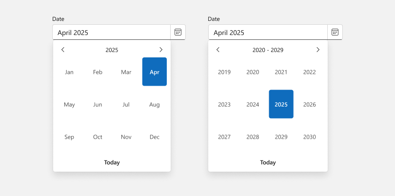
Calendar — Documentation Date Edit — Documentation
Demo: CalendarDemo: Date Edit
#Blazor Date Edit & Time Edit
Custom Increment Step
Time rollers (scroll pickers) for both our Blazor Date Edit and Time Edit components support custom increment steps. This allows you to display fewer values (e.g., an hour in 15 minute intervals) when precise selection is not necessary.
<DxTimeEdit Time="DateTime.Now"
            ScrollPickerFormat="h m s"
            HourIncrement="2"
            MinuteIncrement="15"
            SecondIncrement="15" />

<DxDateEdit Time="DateTime.Now"
            ScrollPickerFormat="h m s"
            TimeSectionHourIncrement="2"
            TimeSectionMinuteIncrement="15"
            TimeSectionSecondIncrement="15" />

Date Edit — Documentation Time Edit — Documentation
Scroll Picker Localization
You can now localize scroll picker column captions in both Blazor Date Edit and Time Edit components.

#Blazor List Box
Select All
The DevExpress Blazor List Box can now display a Select All checkbox and allow users to select/deselect all list items simultaneously. To display this checkbox, enable multiple selection mode and set ShowSelectAllCheckbox and ShowCheckboxes properties to 'true'.
The following code adds a List Box to a DropDown Box and activates the Select All option for the List Box.
<DxDropDownBox @bind-Value="Value"
               QueryDisplayText="QueryText"
               ... >
    <DropDownBodyTemplate>
        <DxListBox Data="@ListBoxData"
                   Values="@(GetListBoxValues(context.DropDownBox))"
                   ValuesChanged="@(values => ListBoxValuesChanged(values, context.DropDownBox))"
                   SelectionMode="ListBoxSelectionMode.Multiple"
                   ShowCheckboxes="true"
                   ShowSelectAllCheckbox="true"
                   ... >
        </DxListBox>
    </DropDownBodyTemplate>
</DxDropDownBox>

@code {
    // ...
    string QueryText(DropDownBoxQueryDisplayTextContext arg) {
        var names = (arg.Value as IEnumerable<Employee>)?.Select(x => x.LastName);
        return names != null ? string.Join(",", names) : string.Empty;
    }
    IEnumerable<Employee> GetListBoxValues(IDropDownBox dropDownBox) {
        return dropDownBox.Value as IEnumerable<Employee>;
    }
    void ListBoxValuesChanged(IEnumerable<Employee> values, IDropDownBox dropDownBox) {
        dropDownBox.BeginUpdate();
        dropDownBox.Value = values;
        dropDownBox.EndUpdate();
    }
}

Demo
API Enhancements
- SearchBoxNullText — Specifies the prompt text displayed in the search box when it is empty.
- SearchBoxInputDelay — Specifies the delay between the last input in the search box and when the List Box displays matching values.
#Column-Specific Cell Templates
DevExpress Blazor ComboBox, List Box, and TagBox now support customization of cell appearance within individual columns.
A column-specific cell template is specified via the CellDisplayTemplate property. This property accepts a cell context and allows you to format cell data, apply styles, and add custom HTML markup.
The CellDisplayTemplate property can be used alongside the ColumnCellDisplayTemplate property of the corresponding DevExpress Blazor component. If both templates are defined, the column-specific template takes precedence over the global ColumnCellDisplayTemplate for cells within a given column. Use this mechanism to define a common template for every column and then override it for columns that require unique formatting.
<DxTagBox Data="Subscriptions.Plans"
            @bind-Values="SelectedPlans"
            EditFormat="{0}" style="width:500px;">
    <Columns>
        <DxListEditorColumn FieldName="Name" Caption="Plan">
            <CellDisplayTemplate>
                <div style="text-align: left;">
                    <b>@context.Value Subscription</b>
                </div>
            </CellDisplayTemplate>
        </DxListEditorColumn>
        <DxListEditorColumn FieldName="PriceMonth" Caption="Month" />
        <DxListEditorColumn FieldName="PriceQuarter" Caption="Quarter" />
        <DxListEditorColumn FieldName="PriceYear" Caption="Year" />
    </Columns>
    <ColumnCellDisplayTemplate>
        <div style="text-align: right;">
            @($"{context.Value:C}")
        </div>
    </ColumnCellDisplayTemplate>
</DxTagBox>

@code {
    IEnumerable<SubscriptionPlan> SelectedPlans { get; set; }
}
Blazor Pivot Table
#Filter Data
Our Blazor Pivot Table allows you to add filter UI capabilities to your application and to filter Pivot Table data in code.
Filter UI
Users can apply filters to row and column fields. Field headers display filter menu buttons with access to filter menus. These filter menus display all unique field values and allow users to select desired values. Filter menus include a built-in search box and a Select All checkbox.
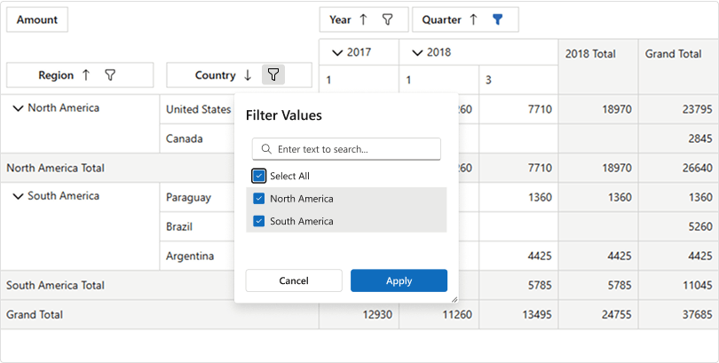
We also give you the ability to define special filter fields. Though these field data are not displayed directly in the main table view, users can filter Pivot Table data based on their values. For example, you might not display car modifications in the table, but need to display cars with a specific modification. You can add the Modification field as a filter field and use it to filter data.
Users can easily access these filter fields in the Filter Header Area, invoke Filter Menus, and select/deselect field values accordingly.

v25.1 also ships with APIs designed to control filter UI capabilities and customize filter menus. For example, you can handle the CustomizeFilterMenu event to customize, add, or remove filter menu items. You can also use FilterMenuTemplate or FieldFilterMenuTemplate to specify custom content for filter menus. The following code categorizes fuel efficiency (MPG City field) into three discrete groups (High, Medium, and Low) to enable filtering based on these categories.
<DxPivotTable Data="@PivotData">
    <Fields>
       <DxPivotTableField Field="@nameof(VehiclesData.TrademarkItem.MPGCity)"
                            Name="@MPGCityName"
                            Area="@PivotTableArea.Filter">
            <FilterMenuTemplate>
                <MPGCustomFiltersList FilterMenuContext="context" Filters="@MPGCityFilterItems"></MPGCustomFiltersList>
            </FilterMenuTemplate>
    </Fields>
</DxPivotTable>

@code {
    // ...
    IReadOnlyList<MPGCustomFilterItem> GetMPGCityFilterItems() {
        return new List<MPGCustomFilterItem> {
            new MPGCustomFilterItem { Text = "High",
                                      Key = 0,
                                      FilterCriteria = CriteriaOperator.Parse($"[{MPGCityName}]>25") },
            new MPGCustomFilterItem { Text = "Medium",
                                      Key = 1,
                                      FilterCriteria = CriteriaOperator.Parse($"[{MPGCityName}]>=15 AND [{MPGCityName}]<=25") },
            new MPGCustomFilterItem { Text = "Low",
                                      Key = 2,
                                      FilterCriteria = CriteriaOperator.Parse($"[{MPGCityName}]<15") }
        };
    }
}

Filter API
The Pivot Table allows you to apply filters in code. You can create filter criteria based on specific values, ranges, or conditions, obtain this criteria, or clear the filter. For example, you might filter sales data to display transactions from a certain region or within a specific date range.
<DxToolbar ItemClick="@OnItemClick">
    <Items>
        <DxToolbarItem Name="_setFilterCriteria" Text="Set Filter Criteria" Tooltip="Set Filter Criteria" />
        <DxToolbarItem Name="_clearFilterCriteria" Text="Clear Filter Criteria" Tooltip="Clear Filter Criteria" />
    </Items>
</DxToolbar>

<DxPivotTable Data="SalesData" @ref="PivotTable"> @*...*@ </DxPivotTable>

<p>Filter Criteria: <b>@PivotTable?.GetFilterCriteria()?.ToString()</b></p>

@code {
    // ...
    void OnItemClick(ToolbarItemClickEventArgs e) {
        switch (e.ItemName) {
            case "_setFilterCriteria":
                PivotTable.SetFilterCriteria(new BinaryOperator(nameof(Sales.SaleInfo.Region), "North America", BinaryOperatorType.Equal));
                break;
            case "_clearFilterCriteria":
                PivotTable.ClearFilter();
                break;
        }
    }
}
Filter Data — Documentation
Demo
#Field Customization
With v25.1, our Blazor Pivot Table allows users to intuitively customize data layout by dragging fields between different areas (Rows, Columns, Data, and Filter) or within the same area.
In addition, a built-in Field List offers a powerful alternative for managing Pivot Table structure. Users can reorder fields, move fields across different areas, and display/hide them from the Field List. These interactive features allow users to configure/personalize the Pivot Table, without modifying the underlying data source or code.

To display the Field List, use the ShowFieldList method. The following code adds a toolbar item that invokes the Field List.
<DxToolbar ItemRenderStyleMode="ToolbarRenderStyleMode.Contained">
    <Items>
        <DxToolbarItem Alignment="ToolbarItemAlignment.Right" Text="Show Field List" RenderStyle="ButtonRenderStyle.Secondary" IconCssClass="pivot-table-icon-field-list" Click="FieldListButton_Click" />
    </Items>
</DxToolbar>

@code {
    object PivotData { get; set; }
    IPivotTable PivotTable { get; set; }

    void FieldListButton_Click() {
        PivotTable.ShowFieldList();
    }
}
Field Customization — Documentation
Demo
#Persistent Layout
The DevExpress Blazor Pivot Table allows you to save and restore layout settings. A saved layout object includes the following data:
- Field settings (field area, field order, field sort order, field visibility)
- Filter criteria
- Expand/collapse state of rows and columns
This option allows users to customize our Blazor Pivot Table to match personal preferences and reload the same layout each time they log into your DevExpress-powered app (said differently, users no longer need to reconfigure Pivot Table field layout, reapply filters, and/or sorting).
Use the following APIs to persist Pivot Table layout:
- LayoutAutoSaving — Fires when Pivot Table settings change (so you can auto-save the layout).
- LayoutAutoLoading — Fires when the Pivot Table component is initialized and starts to load its layout.
- SaveLayout, LoadLayout — Allow you to handle Pivot Table layout on demand (for example, on a button click).
<DxButton Text="Save Layout" Click="OnSaveClick" />
<DxButton Text="Load Layout" Click="OnLoadClick" />

<DxPivotTable @ref="@PivotTable"
              Data="@PivotData"
              LayoutAutoLoading="PivotTable_LayoutAutoLoading"
              LayoutAutoSaving="PivotTable_LayoutAutoSaving">
            @*...*@
</DxPivotTable>
@code {
    //...
     async Task PivotTable_LayoutAutoLoading(PivotTablePersistentLayoutEventArgs e) {
        e.Layout = await LoadLayoutFromLocalStorageAsync();
    }
    async Task PivotTable_LayoutAutoSaving(PivotTablePersistentLayoutEventArgs e) {
        await SaveLayoutToLocalStorageAsync(e.Layout);
    }
    // Refer to https://docs.microsoft.com/en-us/aspnet/core/blazor/state-management
    // to learn more about Blazor state management
    // In Blazor Server apps, prefer ASP.NET Core Protected Browser Storage
    async Task<PivotTablePersistentLayout> LoadLayoutFromLocalStorageAsync() {
        try {
            var json = await JSRuntime.InvokeAsync<string>("localStorage.getItem", LocalStorageKey);
            return JsonSerializer.Deserialize<PivotTablePersistentLayout>(json);
        } catch {
            // Mute exceptions for the server prerender stage
            return null;
        }
    }
    async Task SaveLayoutToLocalStorageAsync(PivotTablePersistentLayout layout) {
        try {
            var json = JsonSerializer.Serialize(layout);
            await JSRuntime.InvokeVoidAsync("localStorage.setItem", LocalStorageKey, json);
        } catch {
            // Mute exceptions for the server prerender stage
        }
    }
    async Task RemoveLayoutFromLocalStorageAsync() {
        try {
            await JSRuntime.InvokeVoidAsync("localStorage.removeItem", LocalStorageKey);
        } catch {
            // Mute exceptions for the server prerender stage
        }
    }
    async Task ReloadPageButton_ClickAsync() {
        await JSRuntime.InvokeVoidAsync("location.reload");
    }
    async Task ResetLayoutButton_ClickAsync() {
        await RemoveLayoutFromLocalStorageAsync();
        await JSRuntime.InvokeVoidAsync("location.reload");
    }
    void OnSaveClick() {
        Layout = MyPivotTable.SaveLayout();
    }

    void OnLoadClick() {
        MyPivotTable.LoadLayout(Layout);
    }
}

Save and Restore Layout — Documentation
Demo
Blazor Rich Text Editor
#Zoom
Our Rich Text Editor's built-in Ribbon includes a UI command designed to zoom in and out of documents.

Set the DxRichEdit.AllowZoom property to false to hide the Ribbon command and disable zoom functionality. Regardless of the AllowZoom property value, you can use the ZoomLevel property to zoom the document in code.
<DxRichEdit ZoomLevel="0.7" />
Demo
Blazor Scheduler
#Toolbar Customization
The DevExpress Blazor Scheduler allows you to define custom toolbar items and customize the following built-in items:
Customization options include:
- Position and alignment of toolbar items.
- Enabled, Visible, Tooltip, and Render Style properties.
Use the ToolbarItems tag to modify the collection of visible toolbar items. Declare DxToolbarItem objects to add custom items to this collection. Alternatively, disable the ShowToolbarArea property to hide the toolbar entirely.
<DxScheduler @bind-StartDate="@StartDate"
             DataStorage="@DataStorage">
    <Views>
        <DxSchedulerTimelineView Duration="@CurrentDuration">
            <Scales>
                <DxSchedulerTimeScale Unit="@SchedulerTimeScaleUnit.Day" UnitCount="1"></DxSchedulerTimeScale>
                <DxSchedulerTimeScale Unit="@SchedulerTimeScaleUnit.Hour" UnitCount="6"></DxSchedulerTimeScale>
            </Scales>
        </DxSchedulerTimelineView>
    </Views>
    <ToolbarItems>
        <DxSchedulerPreviousIntervalToolbarItem />
        <DxSchedulerNextIntervalToolbarItem />
        <DxSchedulerTodayToolbarItem />
        <DxToolbarItem GroupName="ScaleDuration"
                       Text="1 day"
                       Click="@((i) => CurrentDuration = TimeSpan.FromHours(24))"
                       Checked="@(CurrentDuration == TimeSpan.FromHours(24))"
                       BeginGroup="true"
                       Alignment="ToolbarItemAlignment.Right"></DxToolbarItem>
        <DxToolbarItem GroupName="ScaleDuration"
                       Text="2 days"
                       Click="@((i) => CurrentDuration = TimeSpan.FromHours(48))"
                       Checked="@(CurrentDuration == TimeSpan.FromHours(48))"></DxToolbarItem>
        <DxToolbarItem GroupName="ScaleDuration"
                       Text="3 days"
                       Click="@((i) => CurrentDuration = TimeSpan.FromHours(72))"
                       Checked="@(CurrentDuration == TimeSpan.FromHours(72))"></DxToolbarItem>
    </ToolbarItems>
</DxScheduler>

@code {
    DateTime StartDate { get; set; } = DateTime.Today;
    TimeSpan CurrentDuration = @TimeSpan.FromHours(48);
}

Demo
#Appointment Form and Tooltip Customization
You can now specify the size of Scheduler pop-up elements: appointment form (compact/extended) and tooltips. You can also apply CSS classes to these elements.
Our extended appointment form supports drag and resize operations (it is now easier to view the entirety of a calendar without discarding changes).
To incorporate such customizations into your Blazor Scheduler, declare a corresponding object in the PopupSettings tag and specify desired options:
<style>
    .custom-style {
        font-style: italic;
    }
</style>

<DxScheduler StartDate="DateTime.Today"
             DataStorage="DataStorage">
    <Views>
        <DxSchedulerDayView ShowWorkTimeOnly="true" />
    </Views>
    <PopupSettings>
        <DxSchedulerCompactFormSettings MaxHeight="600px"
                                        CssClass="custom-style" />
        <DxSchedulerFormSettings Width="1200px"
                                 AllowDrag="true" />
        <DxSchedulerTooltipSettings MinWidth="300px" />
    </PopupSettings>
</DxScheduler>
#UI/UX Enhancements
We reworked the design of the Devexpress Blazor Scheduler as follows:
- A new render style mode for built-in toolbar items. We changed render style mode to
Plain. - New icons used for the Today button and each view selector (Day, Work Week, Month, Timeline).
- New appointment label colors for the Fluent theme. We updated default label colors, replacing bright colors with a pastel palette. This modification was designed to improve visual clarity and reduces eye strain.
- New status styles for the Fluent theme. Appointment statuses now use styles similar to those of Microsoft Outlook.
With the following changes, you can create compact DevExpress-powered interfaces designed to maximize on-screen information display and page layouts that are visually approachable:
- Appointment captions, time spans, and descriptions are now cropped if they do not fit into allocated space. Users can see cropped content within a default browser tooltip.
- We replaced a button group with a dropdown button for the view selector. This change allows you to add additional custom items to the toolbar.
- You can now change visibility of appointment time spans. Use the
ShowAppointmentDateTimeRange property to save even more space.
Blazor Windows
#Lazy Loading and Pre-Rendering for Popups
DevExpress Blazor popup windows, popup dialogs, fly-outs, and drop-down windows allow you to control when content is rendered. Use the ContentLoadMode property to select the render mode that best suits your needs:
- Use
OnEveryShow to re-render popup content into the DOM each time the popup is opened and remove it from the DOM when the popup is closed (this is how popups were rendered in previous versions). Recommended for popups with frequently updated content, or when the same popup is used to display different data based on context. - Use
OnComponentLoad to pre-render content on page load for instant appearance. - Use
OnFirstShow to render popup content when the popup is opened for the first time (lazy loading). This enhances page load speed and reduces initial resource consumption (works best for fixed-content popups that may not be opened by the user, such as settings dialogs or static help).
<DxWindow @bind-Visible="ConsentVisible"
          HeaderText="We value your privacy"
          ContentLoadMode="PopupContentLoadMode.OnComponentLoad"
          Width="max(25vw, 250px)">
    <p>We use cookies to enhance your browsing experience.
       By clicking "Accept All", you consent to our use of cookies.</p>
    <DxButton Text="Accept All" />
</DxWindow>

@code {
    bool ConsentVisible { get; set; } = false;

    protected override void OnInitialized() {
        ConsentVisible = true;
    }
}
Survey - Blazor
Your Feedback Matters!
Please
login to complete the survey.
Survey Completed
Thank you for taking the time to complete this survey. Your responses have now been posted. If you want to follow up with additional information, feel free to send us an email at clientservices@devexpress.com anytime.
You've Already Completed This Survey
Our records show that you have already completed this survey. If you want to follow up with additional information, send us an email at clientservices@devexpress.com.
This survey has expired
If you want to share your feedback or request new functionality, please submit a new support ticket via the DevExpress Support Center. We’ll be happy to follow up.
Your feedback matters.
Please, review the description of DevExpress Reports-related features below and leave your feedback at the end of the section.
Go to the survey now.
AI-powered Extensions
The features/capabilities described in this section apply to the following:
- WinForms End-User Report Designer
- WinForms Document Viewer
- Blazor Native Report Viewer
- ASP.NET Core/Blazor/Angular/React End-User Report Designer
- ASP.NET Core/Blazor/Angular/React Document Viewer
To add these capabilities to your DevExpress-powered app - regardless of selected AI service - you must register a chat client at runtime.
For WinForms apps, add the DevExpress Behavior Manager component from the Toolbox onto a Form with the DevExpress End-User Report Designer and attach appropriate behaviors. Learn more about AI-powered Behaviors in the following help topic: Create and Configure AI Assistant Behaviors.
For ASP.NET Core and Blazor apps, use the following extension methods at application startup (based on components used):
NOTE: DevExpress does not offer a REST API or ship any built-in LLMs/SLMs. Instead, we follow the BYOL ("bring your own license") principle. To use these features, you need to have an active AI service subscription (e.g., Azure, Open AI, Anthropic Claude, Google Gemini, Mistral AI, etc.) and obtain the REST API endpoint, key, and model deployment name. These variables must be specified at runtime to incorporate/use DevExpress AI-powered Extensions in your application.
#Report Designer — Create AI-powered Reports Using Our Report Wizard (CTP)
The DevExpress Report Wizard now includes an AI-powered report generation option that uses natural language processing to build reports based on text descriptions.
To activate this feature in your DevExpress-powered WinForms app, use the ReportPromptToReportBehavior:

For apps using the DevExpress Web Report Designer, call the AddPromptToReportConverter method at application startup:
builder.Services.AddDevExpressAI(config => {
    config.AddWebReportingAIIntegration(aiConfig => {
        aiConfig.AddPromptToReportConverter();
    });
});
Online Demo
After activation, the Report Wizard interface displays a new AI Prompt-to-Report option:

AI-powered report generation works with two data source options:
- No Data Source - Creates a complete report structure based only on the user's natural language description.
- Add Data Source - Allows users to create a report data source in the first step, displays the data source structure in the Report Wizard interface, and automatically includes this metadata in the LLM prompt. This allows users to reference available data source fields as they create data-bound report elements.

Our Report Wizard interface includes a prompt input area with placeholder fields that guide users toward detailed prompts. Output quality depends on the specificity of the natural language description. Users should include detailed information about layout preferences, calculations, grouping requirements, and visualization types. Like other LLM implementations, the system has limitations and may need modification to meet precise requirements. We also include built-in prompt suggestions to demonstrate effective patterns/functionality so you can configure your own predefined prompts:

Configure Predefined Prompts
You can customize the predefined prompt list through our APIs and align output with specific domain requirements/internal reporting standards:
WinForms
Use the ReportPromptToReportBehavior.PredefinedPrompts property at design-time, or add to the collection at runtime as follows:
using DevExpress.AIIntegration.WinForms.Reporting

behaviorManager1.Attach<ReportPromptToReportBehavior>(reportDesigner1, behavior => {
   behavior.Properties.PredefinedPrompts = new[] {
        new AIReportPrompt() {Text = "Prompt1", Title = "ReportName1"},
        new AIReportPrompt() {Text = "Prompt2", Title = "ReportName2"}
    };
});
ASP.NET Core/Blazor
using DevExpress.AspNetCore.Reporting;
using DevExpress.AIIntegration.Reporting.Common.Models;

//...
builder.Services.AddDevExpressAI(config => {
    config.AddWebReportingAIIntegration(aiConfig => {
        aiConfig.AddPromptToReportConverter(x => {
            x.ConfigurePredefinedPrompts(prompts => {
                prompts.Add(new AIReportPrompt() {
                    Text = "Your Prompt Goes Here..",
                    Title = "The Report Name Goes Here"
                });
            });
        });
    });
});
// ...
Modify Report Generation Process
Use the following properties/methods to manage AI-powered report generation (note that time delays may occur when these properties remain active):
WinForms
RetryAttemptCount — Defines the number of attempts to fix report layout errors that appear in the LLM response.
FixLayoutErrors — Determines whether to automatically resolve report control overlapping.
ASP.NET Core/Blazor
SetRetryAttemptCount — Defines the number of attempts to fix report layout errors that appear in the LLM response.
FixLayoutErrors — Determines whether to automatically resolve report control overlapping.
To learn more about the AI-generated report process, please review the following video:
ASP.NET Core/Blazor Report Designer
Online Demo
Documentation
WinForms End-User Report Designer
Documentation
#Report Designer — Modify Reports Using AI (CTP)
The WinForms End-User Report Designer for .NET now allows you to add and modify report elements through the AI Assistant Chat window using natural language. You can execute commands such as:
- Add/remove report controls (labels, tables, barcodes, etc.)
- Add/remove report bands
- Find report controls by name and modify associated properties (text, expression binding, backcolor and forecolor, etc.)
- Group report data
- Filter report data
- Modify report properties (margins, paper kind, etc.)
- And more…

To incorporate this feature in your DevExpress-powered WinForms app, use the ReportModifyBehavior:

The ReportModifyBehavior ships with the following properties:
- RetryAttemptCount - Defines the number of attempts to fix modification errors that appear in the LLM response and incorrectly apply to a report control.
- FixLayoutErrors - Determines whether to automatically resolve report control overlapping.
To learn more about our AI-powered report modification process, please review the following video:
Since our integrated Chat window leverages the DevExpress Blazor AI Chat control (embedded within WebView), this feature will only work in .NET. To explore this feature in greater detail, please navigate to our demos and…
Highly recommended. You should update the following code to add your AI service credentials. Our demo credentials are rate limited.
Documentation
AzureOpenAIClient azureOpenAIClient = new AzureOpenAIClient(AzureOpenAIEndpointUri, AzureOpenAIKeyCredentials, new AzureOpenAIClientOptions() {
    Transport = new PromoteHttpStatusErrorsPipelineTransport()
});
IChatClient chatClient = azureOpenAIClient.GetChatClient("GPT4o").AsIChatClient();
#Report Designer — Localize Reports with AI
The DevExpress Report Designer now features AI-powered report localization. Once activated, the Localization Editor displays a new "Localize with AI" button that automatically collects all static strings within a report and sends them to your AI service of choice for translation.
To activate this feature in your DevExpress-powered WinForms app, use the ReportLocalizationBehavior:

For ASP.NET Core/Blazor apps, call the AddLocalization method at application startup:
using DevExpress.AspNetCore.Reporting;

//...
builder.Services.AddDevExpressAI(config => {
    config.AddWebReportingAIIntegration(aiConfig => {
        aiConfig.AddLocalization();
    });
});
Review the following videos to learn more:
ASP.NET Core/Blazor Report Designer
Online Demo
Documentation
WinForms End-User Report Designer
Documentation
#Report Designer — Print Preview with AI-generated Test Data
The DevExpress Report Designer allows you to leverage LLMs and generate test data using a data source schema and/or expression bindings defined for report controls.
This will be of value if you design your report and wish to quickly check recent changes without access to a real data source. It also allows report creators to share report documents without including actual data.
For ASP.NET Core/Blazor apps, call the AddTestDataSource method at application startup:
using DevExpress.AspNetCore.Reporting;

// ...
builder.Services.AddDevExpressAI(config => {
    config.AddWebReportingAIIntegration(aiConfig => {
        aiConfig.AddTestDataSource(x => {
            x.SetRowCount(15);
        });
    });
});
Once you activate this AI-powered capability, a Smart Preview ✨ button appears next to the standard Preview button. When clicked, the report designer first asks the LLM to generate sample data using a schema and then creates a report document with this data.
Online Demo
Review the following DevExpress ASP.NET Core Report Designer video to learn more:
Documentation
#Report Designer — Create Expressions with Natural Language
The DevExpress Report Designer allows you to generate Criteria Language expressions with AI assistance, within both the DevExpress Expression Editor and Filter Editor.
For ASP.NET Core/Blazor apps, call the AddPromptToExpressionConverter method at application startup:
using DevExpress.AspNetCore.Reporting;

// ...
builder.Services.AddDevExpressAI(config => {
    config.AddWebReportingAIIntegration(aiConfig => {
        aiConfig.AddPromptToExpressionConverter();
    });
});
Once activated, both the Filter and Expression Editor will display an AI button ✨ (opens a window allowing users to input natural language prompts and apply generated expressions).
Documentation
Online Demo
#Report Viewer — AI-powered Inline Report Translation
The Web Document Viewer, Blazor Report Viewer, and WinForms Report Viewer now include a new "Translate Inline" option in our AI context menu. This feature translates selected content directly within the preview.
To activate this feature in your DevExpress-powered WinForms app, use the DocumentTranslateInlineBehavior:

For ASP.NET Core/Blazor apps, call the AddTranslation method at application startup:
using DevExpress.AspNetCore.Reporting;

// ...
builder.Services.AddDevExpressAI(config => {
    // Use the config.AddBlazorReportingAIIntegration for Native Report Viewer for Blazor.
    config.AddWebReportingAIIntegration(aiConfig => {
        aiConfig.AddTranslation(translationOptions =>
            translationOptions.SetLanguages(new List<LanguageInfo> {
                new LanguageInfo {
                    Text = "Italian",
                    Id = "It"
                }
        }).EnableInlineTranslation().EnableTranslation());
    });
});
Online Demo
DevExpress Report Viewers also include an option to print/export translated content (with a notification about AI-generated content before processing).
This enhancement builds upon our AI-powered translation functionality (detailed in What's New in v24.2). While the original feature displays translations in a separate AI Operations panel, this new option allows users to translate report content directly within the preview and print/export the translated document.
Note that report content appears using fixed-size text bricks, which do not yet adjust dynamically for longer translations. For example, German words tend to be longer than English equivalents and the resulting brick may contain cropped text. For users who need to translate an entire document to review content or copy text in its entirety, we recommend using the AI-powered translation panel instead. Consult the following video for additional information:
Accessibility
#Export to PDF — Table of Contents
We extended our PDF Export engine to generate an accessible-compliant table of contents (TOC). The XRTableOfContents automatically creates the table of contents based on bookmarks assigned to report elements. The TOC in the resulting PDF file builds with properly tagged headings and bookmarks.
DevExpress Visual Studio Report Designer for .NET
#Startup Enhancements & Performance Optimizations
We improved the inter-process communication layer between Visual Studio and the external Report Designer process.
Our Visual Studio Report Designer offers enhanced responsiveness during startup as it now executes most communication-related operations asynchronously. We also optimized logging operations - all logs are now written directly to the Visual Studio output window without invoking the UI thread (to eliminate performance bottlenecks).
Additionally, we optimized the preparation of solution output files for external designer processes to reduce time spent on I/O operations.
The following tables demonstrate performance test results.
Cold Start Time Measurements
| Project | Output Size | v24.2 | v25.1 | Time Diff |
| Project1 | 57 Mb | 00:00:00.052 | 00:00:00.024 | 53.34% |
| Project2 | 60 Mb | 00:00:00.045 | 00:00:00.012 | 74.26% |
| Project3 | 150 Mb | 00:00:00.125 | 00:00:00.027 | 78.71% |
| Project4 | 2700 Mb | 00:00:02.942 | 00:00:00.355 | 87.94% |
Designer Restart After Rebuild Measurements
| Project | Output Size | v24.2 | v25.1 | Time Diff |
| Project1 | 57 Mb | 00:00:00.045 | 00:00:00.011 | 75.44% |
| Project2 | 60 Mb | 00:00:00.039 | 00:00:00.008 | 78.91% |
| Project3 | 150 Mb | 00:00:00.0978852 | 00:00:00.0138932 | 85.81% |
| Project4 | 2700 Mb | 00:00:02.735 | 00:00:00.091 | 96.67% |
All Platforms
#Label and Table Cell Text Formatting — Line Spacing
XRLabel and XRTableCell report controls allow users to define the spacing between lines of text (LineSpacing). This setting improves readability and gives users greater control over individual report layouts. Users can directly modify line spacing for basic report controls to improve multi-line text clarity and reduce the memory footprint associated with the XRRichText control. The following screenshot is of two XRLabels with different line spacing applied:

Documentation
#Detailed Control Over Report Element Export Operations (to Different Formats)
The XRControl.CanPublishOptions property allows you to limit the list of export formats wherein a report control should appear after an export operation. In addition, you can use this new property to prohibit the printing of a specific report control(s).
The following code snippet excludes page information (the XRPageInfo instance) when exporting a report to XLS, XLSX, and CSV formats:
using DevExpress.XtraReports.UI;
// ...
XtraReport report = new XtraReport();
  DetailBand detailBand = new DetailBand();
  report.Bands.Add(detailBand);
  XRPageInfo xrPageInfo1 = new XRPageInfo{
  // Add content.
  };
  detailBand.Controls.Add(xrPageInfo1);
  // Hide xrPageInfo1 from XLS, XLSX, and CSV formats.
  xrPageInfo1.CanPublishOptions.Xlsx = false;
  xrPageInfo1.CanPublishOptions.Xls = false;
  xrPageInfo1.CanPublishOptions.Csv = false;
Imports DevExpress.XtraReports.UI
' ...
Private report As New XtraReport()
  Private detailBand As New DetailBand()
  report.Bands.Add(detailBand)
  Dim xrPageInfo1 As XRPageInfo = New XRPageInfo From { }
  detailBand.Controls.Add(xrPageInfo1)
  ' Hide xrPageInfo1 from XLS, XLSX, and CSV formats.
  xrPageInfo1.CanPublishOptions.Xlsx = False
  xrPageInfo1.CanPublishOptions.Xls = False
  xrPageInfo1.CanPublishOptions.Csv = False
You can also specify CanPublishOptions in the Properties grid:

The following image displays included and excluded page information:

Documentation
#New Report Measurement Units
We extended the ReportUnit enumeration to include Inches and Millimeters. Report creators can now work with measurement values directly, eliminating the need to convert hundredths or tenths to integer units (when sizing and positioning report controls). Once you change report units to new values, the properties panel will display report control size/position as float numbers within the properties panel:
| Property | Hundredths of an Inch | Inch |
| Height | 53.2 | 0.532 |
| Width | 206.8 | 2.068 |
| Property | Tenths of a Millimeter | Millimeters |
| Height | 135.1 | 13.51 |
| Width | 662.6 | 66.26 |
This change also affects XtraReport.PageHeightF and XtraReport.PageWidthF properties (which now use float instead of integer).

Reporting for Desktop
#Report Designer — Proportional Report Controls Resize Operations
Report creators can now press Shift to resize report controls with corner anchors and preserve aspect ratios both in WinForms and WPF Report Designers.

#Report Designer — Drag and Drop Enhancements for Date-based Field Types
The Field List pane in the DevExpress WinForms Report Designer offers easier access to System.DateTime, System.DateOnly, and System.TimeOnly types used within a report's data source. Users can now expand these fields in the Field List panel to reveal associated internal properties and seamlessly bind them to report controls.
With this enhancement, you no longer need to manually specify data formatting or use expression functions when working with internal properties: simply drag & drop these properties onto existing controls to establish new data bindings or place them on the report surface to create new data-bound controls.
To display internal date and time properties in the Field List, activate the UserDesignerOptions.ShowFieldListDateTimeComponents property at application startup or in the DevExpress Visual Studio Report Designer settings window. Doing so will expose the following properties:
- DateOnly: Month, Year, Day
- DateTime: Day, Month, Year, Hour, Minute, Second
- TimeOnly: Hour, Minute, Second
Configurable Binding Modes
This option supports two binding modes (managed via the UserDesignerOptions.DateTimeComponentBindingMode property). When a field is dropped from the Field List, the Report Designer for WinForms automatically creates an expression binding and does one of the following:
- Applies a format string (for example,
{0:%d}, {0:%M}) — useful for displaying formatted date/time values within a report.
- Assigns an expression function (for example,
GetDay, GetMonth) — ideal for calculations against multiple data source fields. You can further refine expressions using the Expression Editor.
Expression Editor Integration
This enhancement also extends to the DevExpress Expression Editor, where appropriate expression functions are automatically assigned when you double-click internal type properties in the Field List.
#DateOnly & TimeOnly Support — Range Report Parameters
We expanded support for DateOnly and TimeOnly .NET types across DevExpress Reports for WinForms. The Report Viewer can use these parameters to filter report data at the data source and report level (by date and time range).

Users can now filter reports by date range without time components or specify time range independent of date.
Use the following code snippet to create and add DateOnly and TimeOnly range parameters to a report at runtime:
var report = new XtraReport();
// ...
// Add the start interval value.
var p1start = new RangeStartParameter() {
    Type = typeof(DateOnly),
    Value = DateOnly.FromDateTime(DateTime.Today).AddDays(-7),
};

// Add the end interval value.
var p1end = new RangeEndParameter() {
    Type = typeof(DateOnly),
    Value = DateOnly.FromDateTime(DateTime.Today),
};

// Add the range parameter.
var p1 = new Parameter() {
    Type = typeof(DateOnly),
    Value = DateOnly.FromDateTime(DateTime.Today),
    ValueSourceSettings = new RangeParametersSettings(p1start, p1end)
};

report.Parameters.Add(p1);

// Add the start interval value.
var p2start = new RangeStartParameter() {
    Type = typeof(TimeOnly),
    Value = TimeOnly.FromTimeSpan(TimeSpan.FromMinutes(10)),
};

// Add the end interval value.
var p2end = new RangeEndParameter() {
    Type = typeof(TimeOnly),
    Value = TimeOnly.FromTimeSpan(TimeSpan.FromMinutes(30)),
};

// Add the range parameter.
var p2 = new Parameter() {
    Type = typeof(TimeOnly),
    Value = TimeOnly.FromDateTime(DateTime.Today),
    ValueSourceSettings = new RangeParametersSettings(p2start, p2end)
};

report.Parameters.Add(p2);
Range parameter editors include a customizable list of predefined ranges. Use the DevExpress.XtraReports.Parameters.RangeParameterEditorOptions class to add a custom range at runtime:
RangeParameterEditorOptions.PredefinedTimeRanges.Remove("Lunch Time");
RangeParameterEditorOptions.RegisterTimeRange("MyTimeInterval", () => new TimeOnly(10, 30, 00), () => new TimeOnly(11, 30, 0));
Reporting for Web
#Web Report Designer — External Drag & Drop Operations
The DevExpress Web Report Designer supports drag & drop operations from outside the browser window (making it easier to add content to your report documents):
- Image files - Drag & drop an image file onto the report surface to create an
XRPictureBox.
- Text files - Drop a TXT file to create an
XRLabel, or drop an RTF, DOCX, or HTML file to insert an XRRichText control with associated file content.
- PDF files - Drop a PDF file to insert an
XRPdfContent control.
- Existing controls - Dropping a file onto an existing report control updates content with new file data.
#Web Report Designer — Quickly Create Header Tables
The DevExpress Web Report Designer allows designers to quickly create table headers. When you design a report, select a set of data fields within the Field List, an entire query, a table, or individual fields while holding Ctrl. To create a table with data field names, press Shift while dragging the table onto the report design area.
#Web Report Designer — Snapping to Grid
The DevExpress Web Report Designer now supports Snapping to Grid, a layout feature that aligns report controls (like labels, tables, and images) to an invisible grid as you move or resize elements. This enhancement ensures consistent spacing/alignment and improves design workflows (especially for complex report layouts).
Available options are "snap to lines" and "snap to grid".
When a report's snapping mode is set to Snap to Grid, the top left corner of a report control aligns with the report's snap grid:
#Standalone Report Parameters Panel for React
Our standalone Report Parameters Panel is a new React component that arranges report parameter editors. It retrieves report parameter details from a DevExpress report instance passed from the backend.
Use this component to programmatically create a report, then export or email the document without displaying a preview to the end user. The component helps reduce memory usage because it eliminates the need to generate report images in the background and transfer them to a client application.

Documentation
Survey - Reports
Your Feedback Matters!
Please
login to complete the survey.
Survey Completed
Thank you for taking the time to complete this survey. Your responses have now been posted. If you want to follow up with additional information, feel free to send us an email at clientservices@devexpress.com anytime.
You've Already Completed This Survey
Our records show that you have already completed this survey. If you want to follow up with additional information, send us an email at clientservices@devexpress.com.
This survey has expired
If you want to share your feedback or request new functionality, please submit a new support ticket via the DevExpress Support Center. We’ll be happy to follow up.
Your feedback matters.
Please, review the description of BI Dashboard-related features below and leave your feedback at the end of the section.
Go to the survey now.
Data Management-related Enhancements
#DateOnly & TimeOnly Support
We've expanded support for System.DateOnly and System.TimeOnly .NET types across DevExpress Dashboards. DateOnly and TimeOnly can be used in the following scenarios:
Dashboard Item support applies to the following:
- Grid and Pivot — Bind columns to
DateOnly and TimeOnly types and select different date-time patterns and grouping intervals ("Year to Month", "Day-Month-Year", "Year to Day", "Day of Week", and hour/minute-based intervals).
- Pie and Charts
- Range Filter — Use date-based predefined intervals (for example, last year, last quarter, last 7 days, etc).
- Date Filter — Choose predefined intervals and customize date periods.

Export Enhancements
#Export to SVG
You can now export entire dashboards, individual dashboard items, and dashboard tab pages to SVG.

SVG exports produce high-quality, resolution-independent, scalable vector images suitable for printing, sharing, or embedding in documents.

Data Loading
#Web Dashboard - Request Parameters
Dashboard creators can now display the "Dashboard Parameters" window before a dashboard loads and aggregates data. Data will be loaded after the user submits parameter values. This allows dashboard viewers to customize the initial state.

Documentation
Accessibility Enhancements
#Alternative Text
Alternate Text is now available for Bound Image and Image dashboard items.
#WinForms Dashboard — UI Automation
- You can now navigate through Dashboard items and elements in the Data Inspector Window using keyboard shortcuts.
- Screen readers can now read contents of Grids, Cards, Filter elements, and other dashboard items (along with our Data Inspector and Export dialogs).
#Web Dashboard — General Accessibility Enhancements
- Enhanced navigation and screen reader support for Card items. Card content is now accessible to screen readers. You can use cards as master filters directly from the keyboard.
- Enhanced keyboard support for dashboard title and dashboard item captions, including drop-down menus.
- Improved accessible names for the custom range editor in a Range Filter.
Survey - BI Dashboard
#Your Feedback Matters!
Please
login to complete the survey.
Survey Completed
Thank you for taking the time to complete this survey. Your responses have now been posted. If you want to follow up with additional information, feel free to send us an email at clientservices@devexpress.com anytime.
You've Already Completed This Survey
Our records show that you have already completed this survey. If you want to follow up with additional information, send us an email at clientservices@devexpress.com.
This survey has expired
If you want to share your feedback or request new functionality, please submit a new support ticket via the DevExpress Support Center. We’ll be happy to follow up.
Your feedback matters.
Please, review the description of DevExpress Office File API-related features below and leave your feedback at the end of the section.
Go to the survey now.
PDF Document API
#PDF Document Compression
Preserve Compressed Object Streams when Saving
In previous versions, our PDF processing engine supported compressed object streams only when reading documents. When saving, the DevExpress PDF Document API library wrote PDF object streams in an uncompressed form.
To reduce file size when saving PDF documents using the DevExpress PDF Document API library, v25.1 ships with a new compression engine designed to preserve the original/compressed state of PDF object streams. Our compression mechanism automatically applies to various document structures (text, PDF forms, fonts, and more) and allows you to modify/save PDF files more efficiently.
Compressed object streams are only preserved for documents imported using LoadDocument methods. If you copy a page from one document to another or merge multiple documents into a single document, the object streams for appended pages/documents will be uncompressed.
Image Compression API
v25.1 includes APIs designed to compress document image size. These include our new PdfDocumentProcessor.OptimizeDocument method and the PdfImageCompressionOptions class (to specify desired compression settings). With PdfImageCompressionOptions, you can set target JPEG quality (in percent), specify downsampling DPI (the DownsamplingResolution property), and choose interpolation mode for document images.
Call the PdfDocumentProcessor.OptimizeDocument method before saving your document to optimize/reduce output PDF file size. This new option can also help improve printing performance for PDF documents that contain images.
using (PdfDocumentProcessor pdfProcessor = new PdfDocumentProcessor()) {
    pdfProcessor.LoadDocument("Example.pdf");
    var options = new PdfImageCompressionOptions() {
        JpegQuality = 40,
        DownsamplingResolution = 100,
        InterpolationMode = DevExpress.Drawing.DXInterpolationMode.HighQualityBicubic,
    };
    pdfProcessor.OptimizeDocument(options);
    pdfProcessor.SaveDocument("Example_Compressed.pdf");
}
NOTE: Image compression efficiency depends on the number of images in a source document, original size, and physical size on a PDF page.
#PDF Redaction API
v25.1 includes new APIs to create and manage redaction annotations. With this capability, you can hide/remove sensitive or private content from your documents and add a colored text overlay across the redacted area.
The redaction process involves two steps:
- Create a redaction annotation with desired appearance in the PDF page area (or value if you wish to hide content but retain it for other users).
- Clear content using the annotation and apply the overlay with specified appearance settings. In this instance, hidden content will be removed.
Create a Redaction Annotation
Redaction is available using the PDF Facade API. To create a redaction annotation, you must:
PdfDocumentProcessor pdfProcessor = new PdfDocumentProcessor();
pdfProcessor.LoadDocument("Demo.pdf");

PdfDocumentFacade documentFacade = pdfProcessor.DocumentFacade;
PdfRectangle pageCropBox = pdfProcessor.Document.Pages[0].CropBox;
PdfRectangle redactBounds =
    new PdfRectangle(0, pageCropBox.Height-50, 200, pageCropBox.Height);

// Add a redaction annotation at the top left corner of the first document page
PdfRedactAnnotationFacade redactAnnotation =
    documentFacade.Pages[0].AddRedactAnnotation(redactBounds);
redactAnnotation.Author = "Jane Doe";
// Setup the appearance of the redaction annotation
redactAnnotation.FillColor = new PdfRGBColor(0, 0, 0);
redactAnnotation.FontColor = new PdfRGBColor(1, 1, 1);
redactAnnotation.FontName = "Calibri";
redactAnnotation.FontSize = 0; // enables font auto-size
redactAnnotation.OverlayText = "Classified";
redactAnnotation.TextJustification = PdfTextJustification.Centered;
redactAnnotation.RepeatText = false;

// Save the document with the redaction annotation and send it for review
pdfProcessor.SaveDocument("output_to_review.pdf");
Apply Redaction Annotations
New API allows you to apply the following annotations:
You can also use DevExpress.Pdf.PdfClearContentOptions to specify the type of the content to remove (text, graphics, images, or annotations) when you apply the redaction.
Documentation
PdfDocumentProcessor pdfProcessor = new PdfDocumentProcessor();
pdfProcessor.LoadDocument("Demo.pdf");

PdfDocumentFacade documentFacade = pdfProcessor.DocumentFacade;
// Review redaction annotations and apply
foreach (var page in documentFacade.Pages)
{
    var redactionAnnotations =
        page.Annotations.Where(annotation => annotation is PdfRedactAnnotationFacade).ToList();
    foreach(PdfRedactAnnotationFacade annotation in redactionAnnotations)
    {
        if (annotation.Author == "Jane Doe")
            annotation.Apply();
    }
}
// Apply redaction annotations for a page
documentFacade.Pages[0].ApplyRedactAnnotations();
// Apply redaction annotations for the entire document
documentFacade.ApplyRedactAnnotations();
// Specify clear content settings and apply redaction annotations
documentFacade.ApplyRedactAnnotations(new PdfClearContentOptions()
{
     ClearAnnotations = true,
     ClearImages = true,
     ClearText = true,
     ClearGraphics = false
});
Documentation
Spreadsheet Document API
#OLE Objects
The DevExpress Spreadsheet Document API Library now supports OLE objects. OLE (Object Linking and Embedding) allows you to link external files and embed data (spreadsheets, PDFs, mail messages, presentations, etc.) into your Excel documents.
With OLE Object support, you can execute the following operations:
- Create OLE objects that store links to external files or embed data from these files in your document;
- Obtain OLE object properties;
- Extract OLE object data from a document;
- Remove OLE objects from a document;
- Print and export documents with OLE object icons to PDF and image formats;
- Load and save documents that contain OLE objects without content loss.
An OLE object is the represented by the OleObject interface. As a unique document shape, the OLE object inherits all the settings from the base Shape interface. Shape settings define OLE object's icon appearance, location, and internal object properties (including name, icon size, icon position in a worksheet, alt text, etc).
To access OLE objects in a worksheet, use the Worksheet.OleObjects collection. They are also available through the base Worksheet.Shapes collection. The OleObjectCollection.AddLinkedOleObject and OleObjectCollection.AddEmbeddedOleObject methods allow you to create a new linked or embedded OLE objects in a worksheet.
Worksheet worksheet = workbook.Worksheets[0];
CellRange oleIconRange = worksheet.Range["B4:D6"];
SpreadsheetImageSource oleIcon = SpreadsheetImageSource.FromFile("oleIcon.png");

// Create linked OLE object.
OleObject oleObjectLinked = worksheet.OleObjects.AddLinkedOleObject(
    oleIconRange, "package.pdf", OleObjectType.Package, oleIcon);

// Create embedded OLE object from byte array.
byte[] sourceData = File.ReadAllBytes("package.pdf");
OleObject oleObjectEmbedded1 = worksheet.OleObjects.AddEmbeddedOleObject(
    oleIconRange, sourceData, OleObjectType.Package, oleIcon);

// Create embedded OLE object from file stream.
using (var stream = File.OpenRead("package.pdf")) {
    OleObject oleObjectEmbedded2 = worksheet.OleObjects.AddEmbeddedOleObject(
    oleIconRange, stream, OleObjectType.Package, oleIcon);
}
You can also extract and analyze linked and embedded data. Use the OleObject.InsertType property to determine OLE object type (linked or embedded). The OleObject.AsLinkedContent and OleObject.AsEmbeddedContent methods allow you to extract additional information based on the OLE object type. For linked objects, you can obtain the linked file name using the OleObjectLinkedContent.FileName property. For embedded objects, you can get the raw binary content using the OleObjectEmbeddedContent.GetRawData method or save embedded content to a file using the OleObjectEmbeddedContent.SaveAs method.
Worksheet worksheet = workbook.Worksheets[0];
OleObject oleObject = worksheet.OleObjects[0];
if(oleObject.InsertType == OleObjectInsertType.Linked)
{
    OleObjectLinkedContent linkedContent = oleObject.AsLinkedContent();
    string linkedFileName = linkedContent.FileName;
}
if(oleObject.InsertType == OleObjectInsertType.Embedded)
{
    OleObjectEmbeddedContent embeddedContent = oleObject.AsEmbeddedContent();
    byte[] oleRawData = embeddedContent.GetRawData();
    if (oleObject.Type == OleObjectType.AdobeAcrobatDocument)
        using (FileStream stream = new FileStream("embedded_document.pdf", FileMode.Create, FileAccess.Write))
            embeddedContent.SaveAs(stream);
}
You can also remove OLE objects from your spreadsheets. Use the OleObject.Delete, OleObjectCollection.Remove or OleObjectCollection.RemoveAt method to remove individual OLE objects, or use the OleObjectCollection.Clear method to remove all OLE objects from a worksheet.
OleObject oleObject = worksheet.OleObjects[0];

// Remove the current OLE object.
oleObject.Delete();
// or
worksheet.OleObjects.Remove(oleObject);

// Remove all OLE objects in the collection.
worksheet.OleObjects.Clear();
NOTE
OLE object support is only available in OpenXML-based file formats (XLSX, XLSM, XLTX, and XLTM).
Documentation
Word Processing Document API
#Right-to-Left (RTL) Engine Enhancements
We enhanced our Right-to-Left text rendering engine (improved text order in paragraphs, headers and footers, numbering lists, tables and shapes with bi-directional text including mixed Right-to-Left and Left-to-Right text blocks).
Available when you generate a PDF file, image, or print output via the User Interface or code.
#CJK (Chinese, Japanese and Korean) Text Wrapping
v25.1 adds CJK text wrapping and line-break rule support. In previous versions, DevExpress Word-processing libraries applied Latin text wrapping rules (which rely on space characters and punctuation marks) to Chinese, Japanese, and Korean text.
New wrapping rules correctly apply line breaks between individual characters across document paragraphs, headers and footers, tables, and shapes. Documents that use CJK text wrapping rules can now be printed/exported to PDF and image formats with appropriate text layouts.
#PDF Export - Convert Word Content Controls to PDF AcroForm Fields
We enhanced our Word Document to PDF export engine with built-in conversion of Word content controls to PDF AcroForm fields.
DevExpress Word-processing tools automatically convert the following content control types:
- Plain Text
- Rich Text
- Picture
- Check Box
- Combo Box
- Drop-Down List
- Date Picker
NOTE
Building Block and Repeating Section content controls are exported as regular text.
Due to PDF format limitations, PDF text fields generated from Rich Text content controls use formatting from the first word of the original Rich Text content control. Rich Text content controls that split pages or contain complex objects (like tables) are exported as regular text.
To enable this functionality capability, you must:
using DevExpress.XtraPrinting;
using DevExpress.XtraRichEdit;

using(RichEditDocumentServer wordProcessor = new RichEditDocumentServer())
{
    wordProcessor.LoadDocument("input_content_controls.docx");
    PdfExportOptions options = new PdfExportOptions();
    options.ExportEditingFieldsToAcroForms = true;
    wordProcessor.ExportToPdf("output_with_acroform.pdf", options);
}
Documentation
Demo: AcroForms
#Compare Word Documents
v25.1 includes new APIs to programmatically compare two Word documents. New CompareDocumentExtensions.Compare extension methods allow you to perform the following operations:
- Identify changes between two documents and generate document output with revisions.
- Compare both document text and formatting (including the case-sensitivity).
- Compare content in document headers, footers and textboxes.
- Setup author/date of output revisions.
- Compare content at the word or character level.
- Return the document with revisions as a new Document instance for further processing (or automatically replace an input document with revised content)
NOTE
Input documents must not include document revisions. Otherwise, our Compare method will throw an exception.
RichEditDocumentServer wordProcessor1 = new RichEditDocumentServer();
wordProcessor1.LoadDocument("FirstLook_original.docx");
Document originalDocument = wordProcessor1.Document;

RichEditDocumentServer wordProcessor2 = new RichEditDocumentServer();
wordProcessor2.LoadDocument("FirstLook_revised.docx");
Document revisedDocument = wordProcessor2.Document;
// Setup compare options and generate output with revisions.
Document docWithRevisions = originalDocument.Compare(revisedDocument, new CompareDocumentOptions() {
    Author = "Jane Doe",
    DateTime = DateTime.Now,
    ComparisonLevel = ComparisonLevel.Word,
    CompareCaseChanges = false,
    CompareFormatting = true,
    CompareHeadersAndFooters = true,
    CompareTextBoxes = true
});

// Save output with revisions to a new file.
docWithRevisions.SaveDocument("output_with_revisions.docx", DocumentFormat.Docx);

// Compare two documents and add revisions to the original document.
originalDocument.Compare(revisedDocument, new CompareDocumentOptions(), ComparisonTargetType.Original);
Documentation
Demo: Compare Documents
Survey - Office File API
Your Feedback Matters!
Please
login to complete the survey.
Survey Completed
Thank you for taking the time to complete this survey. Your responses have now been posted. If you want to follow up with additional information, feel free to send us an email at clientservices@devexpress.com anytime.
You've Already Completed This Survey
Our records show that you have already completed this survey. If you want to follow up with additional information, send us an email at clientservices@devexpress.com.
This survey has expired
If you want to share your feedback or request new functionality, please submit a new support ticket via the DevExpress Support Center. We’ll be happy to follow up.
Your feedback matters.
Please, review the description of Cross-Platform .NET App UI (XAF) and Web API Service related features below and leave your feedback at the end of the section.
Go to the survey now.
Grid and Tree List Editor — Blazor UI
#Relative Splitter Position
The IModelSplitLayout.RelativePosition property determines the splitter's position in relation to the DetailView as a percentage (when MasterDetailMode = ListViewAndDetailView). It is automatically set when a user adjusts the splitter and takes precedence over the pixel-based SplitterPosition property.

#Extended Context Menu
Our DxGridListEditor includes new Best Fit and Clear Sorting context menu commands for grid column headers.

#PDF Export Support
With v25.1 you can export List View content to PDF. Both DxTreeListEditor and DxGridListEditor support this capability.

To customize export settings, subscribe to the CustomizeGridExport event and use the DocumentOptions property:
using DevExpress.Blazor;
using DevExpress.ExpressApp;
using DevExpress.ExpressApp.Blazor.SystemModule;

public class CustomizeExportControllerBlazor : ViewController<ListView> {
    private BlazorExportController blazorExportController;
    protected override void OnActivated() {
        base.OnActivated();
        blazorExportController = Frame.GetController<BlazorExportController>();
        // Subscribe to CustomizeGridExport event.
        blazorExportController.CustomizeGridExport += blazorExportController_CustomizeGridExport;
    }
    void blazorExportController_CustomizeGridExport(object sender, GridExportEventArgs e) {
        // Export only selected rows in PDF.s
        if (e.DocumentOptions != null) {
            e.DocumentOptions.ExportSelectedRowsOnly = true;
        }
    }
    protected override void OnDeactivated() {
        blazorExportController.CustomizeGridExport -= blazorExportController_CustomizeGridExport;
        base.OnDeactivated();
    }
}
#Virtual Scrolling Mode
You can now enable virtual scrolling mode (instead of traditional pagination) for your List View:

#Banded Layout
v25.1 adds support for Banded layouts (much like XAF WinForms):

Common Enhancements — Blazor UI
#Masks for Date and Time Properties
XAF Blazor Date and Time Property Editors support masked input. The EditMask property restricts user input and can be specified in the Application Model: BOModel > YourBusinessClass > Property > EditMask. You can also customize mask settings for TimeOnly - TimeSpan and DateOnly – DateSpan type pairs separately in code.
View.CustomizeViewItemControl<TimeSpanPropertyEditor>(this, editor => {
    // TimeSpan
    editor.DxTimeEditMaskProperties.DateTime.CaretMode = MaskCaretMode.Advancing;
    // TimeOnly
    editor.DxTimeEditMaskProperties.TimeOnly.CaretMode = MaskCaretMode.Regular;
});
#Middle Tier Security (CTP)
XAF Blazor now supports Middle Tier Security for secure communication between the frontend and backend, helping to protect sensitive data and enforce stricter access controls.
See also: T1295981 - MiddleTierSecurityOptions and EFCoreMiddleTierSecurityOptions have been moved to different namespaces and NuGet packages.
Create a .NET Application with EF Core Middle Tier Security — Documentation
#Razor Component support for Control Detail Items
XAF Blazor v25.1 includes a new BlazorControlViewItem so you can integrate custom ASP.NET Core Blazor components within a Detail View. This new class simplifies the creation of view items (it offers setup within a single razor file and reduces the amount of code you’d otherwise need to write).
#ToolTip Attribute Enhancements
XAF Blazor v25.1 supports the following UI elements for the ToolTip attribute (and the IModelToolTip.ToolTip property in the Application Model):
- Navigation groups and items
DxGridListEditor and DxTreeListEditor column headers- Layout group headers
[ToolTip("View, assign or remove employees for the current task")]
public virtual IList<Employee> Employees { get; set; }
#Enhanced Keyboard Support - Menu Shortcuts
As part of ongoing Accessibility (A11Y) investments for both XAF and DevExpress UI components, XAF developers will be able to specify appropriate keystroke combinations in the Model Editor or in code (similar to XAF WinForms with its ActionBase.Shortcut API). In addition to A11Y benefits, this will also facilitate CRUD operations for end-users (for example, to save changes, create, or delete records). Examples:
-
New: Ctrl+Shift+A
-
Save: Ctrl+Shift+S
-
Logon: Enter
-
DialogOK: Ctrl+Shift+Enter
-
Refresh: Ctrl+Shift+R
-
Delete: Ctrl+Delete
-
NextObject: Ctrl+Alt+RightArrow
-
PreviousObject: Ctrl+Alt+LeftArrow
-
SaveAndClose: Ctrl+Shift+Enter

#Enhanced Filtering by Non-Persistent Fields
With this release, XAF's FilterController (and other XAF APIs working with server-side criteria) process non-persistent business class properties in Client data access mode more efficiently (for EF Core). Once non-persistent properties are detected in ListView criteria, XAF fully processes it on the client side.
XAF Blazor v25.1 also removes non-persistent/non-aliased properties (see 1-2 below) from the FilterPropertyEditor menu/user selection for both EF Core and XPO ORM (for example, defined with the NotMapped attribute). Calculated properties defined with the PersistentAlias and Calculated attributes are NOT removed (see 3-4 below). This change impacts our standalone Filter Editor in both the DetailView and ListView when DataAccessMode is not Client.
See also: T1287746 - FullTextSearchAction - Non-persistent properties are now included in full text search for Client data access mode

#.NET Aspire Integration
.NET Aspire Integration
Our team has spent some time considering the capabilities of Aspire, isolating the best integration points and allowing XAF developers to take advantage of Aspire orchestration features out of the box. The team sees Aspire as a potential "1-click solution", a more modern alternative to some templates in the XAF Solution Wizard. Benefits include:
-
Simplify long and error-prone setup processes like those we describe in our documentation for Azure App Service and Nginx support on Linux, as well as other popular web server configurations.
-
Provision required databases and other application resources for both development and deployment environments (for instance, using a Docker setup).
Our goal is to help save time, whether using XAF or not. Much of this remains a moving target, since Microsoft continues to evolve Aspire. At the same time, some functionality is already used and is considered stable. As such, we decided to publish details to help you make use of Aspire-specific tools in your own XAF project. Please refer to the following documents for additional information:
#Simplified Chart Control Integration
XAF Blazor v25.1 introduces a new DxChartListEditor based on the DxChart component. The editor takes a Razor file as input (with required graph layout and series settings). XAF ASP.NET Core Blazor binds the underlying control to current View data automatically.
DxChartListEditor supports popular chart types, such as Line, Area, Bar, Point, Range, Financial, Pie and Donut, Polar, Sparklines, Histogram, and Drill Down.
To create a Chart View in your XAF Blazor application, you must:
Create a Razor component and specify DxChart's configuration components. For example:
File: CS\MainDemo.Blazor.Server\Charts\PaycheckSettings.razor
@using DevExpress.Blazor
@using MainDemo.Module.BusinessObjects

<DxChartLineSeries Name="Gross Pay"
              ArgumentField="(Paycheck p) => p.PaymentDate"
              ValueField="(Paycheck p) => p.GrossPay"
              SummaryMethod="Enumerable.Sum" />
<DxChartLineSeries Name="Net Pay"
              ArgumentField="(Paycheck p) => p.PaymentDate"
              ValueField="(Paycheck p) => p.NetPay"
              SummaryMethod="Enumerable.Sum" />
Ensure that the Razor file's Build Action property is set to Content.
- Invoke the Model Editor for your ASP.NET Core Blazor project and create a List View node in Model Editor that defines a List View to be visualized as a chart. Set the
EditorType property of the node to DxChartListEditor.
In the Model Editor, navigate to the required List View, and set the SettingsTypeName property to the full name of your Razor component.
You can also specify chart settings in code:
File: CS\MainDemo.Blazor.Server\Controllers\MyBlazorController.cs
using System;
using DevExpress.ExpressApp;
using DevExpress.ExpressApp.Blazor.Editors;

namespace MainDemo.Blazor.Server.Controllers;
public class MyBlazorController : ViewController<ListView> {
  protected override void OnViewControlsCreated() {
      base.OnViewControlsCreated();
      if (View.Editor is DxChartListEditor chartListEditor) {
          // Place your chart configuration code here.
          chartListEditor.ChartModel.Width = "100%";
      }
  }
}
For more information, refer to the following topic: Chart Module.
#DisplayFormat Support in XAF Lookup Property Editor
In v25.1, Lookup Property Editor columns support the DisplayFormat property:

#Control Over Navigation Panel Visibility at Startup
You can now control initial visibility of the navigation panel in your XAF-powered Blazor application. Set the ShowNavigationOnStart property to false to collapse the Navigation Panel at application startup.

#Fluent UI Theme and Icons
Just over a year ago, Microsoft released a new Outlook for Windows and macOS with a modern and simplified design. This updated version of Outlook offers a streamlined, web–integrated experience that aligns with Microsoft's Fluent 2 design standards. Many of our customers have expressed interest in replicating this contemporary UI within their own DevExpress-powered desktop and web applications. If you've used the new version of Outlook, you know that Microsoft's new user experience extends far beyond simple UI enhancements:
- The app's sidebar extends up to the form title, optimizing vertical space to display more menu items on–screen.
- The sidebar can be 'collapsed' using the Ribbon's hamburger button, allowing for a more compact layout.
- The Ribbon control and form title can host additional UI elements, including buttons, a search panel, and other interactive UI components.
- Fluent UI enhancements include semi–transparent effects, colorful flat icons, rounded corners, specious paddings, and more.
We expect to support Fluent and Ribbon UI in XAF Blazor-powered apps at the end of 2025 (v25.2). For v25.1, we completed required research and implemented the following:
- Added support for new Fluent Dark and Light themes for key UI controls (the Report Viewer, Designer and other UI components will be supported in v25.2+).
- Created ~200 of XAF-specific icons (filled or outlined) to match the Fluent theme.
- Modified menu and layout paddings in both Compact and Standard modes (to better mimic modern Office-inspired web apps).
NOTE: This XAF Blazor feature is available as a Community Technology Preview (CTP) in v25.1. Fluent UI support for XAF WinForms should be officially available in v25.2+ (once support is added to corresponding DevExpress WinForms UI components).

EF Core Enhancements
#Concurrency Control for EF Core
XAF Blazor/Windows Forms EF-Core based apps support Optimistic Concurrency control (on par with existing XPO ORM functionality). This capability is enabled for all classes that implement the new IOptimisticLock interface (for example, all classes inherited from XAF’s BaseObject). You can use the OptimisticLockIgnore attribute to disable this capability for selected classes or properties.

With OptimisticLockDetection and OptimisticLockHandling options you can fine-tune collision detection and merge strategies both on object-level and field-level. You can set up a combination of these options either in the Application Builder for all classes or use OptimisticLockAttribute (to specify a custom strategy for a specific class).
builder.ObjectSpaceProviders
  .AddEFCore(options =>
  {
      options.PreFetchReferenceProperties();
      options.OptimisticLockDetection = OptimisticLockDetection.AllFields;
      options.OptimisticLockHandling = OptimisticLockHandling.Merge;
  })

No breaking changes are expected for existing EF Core projects when using the DevExpress Project Converter (to handle all database changes automatically). See Also: T1273764 - Core - Database and data model code changes for XAF EF Core apps to support the Optimistic Locking
#Clone Object Module for EF Core
With v25.1, XAF Blazor and Windows Forms EFCore-based apps support the Clone command. With this enhancement, you can quickly copy data records including aggregated detail collections.
We unified cloning functionality and APIs for both ORMs, so XAF developers can use a single DevExpress.ExpressApp.CloneObject package. For additional information, refer to T1276850 - Core - The DevExpress.ExpressApp.CloneObject.Xpo assembly and NuGet package have been renamed.

#Easier Database Schema Updates When a New Class or Property Is Added (XPO Parity)
v25.1 simplifies database updates for EF Core developers (targeting XAF WinForms/Blazor or Web API Service-based apps). For instance, when you add a new business class or a property at design time, XAF will automatically update database structure in Debug mode (similar to XPO ORM functionality). This will save development time because no extra methods will be necessary, especially for frequent data model changes.
We also removed the redundant DBUpdater tool for .NET/.NET-based apps for EF Core and XPO ORM. XAF developers can now use the updateDatabase CLI command) of the underlying application instead. This will simplify the developer experience for both deployment and maintenance because a single method will be used. For additional information, refer to T1282681 - Database schema update behavior has changed for EF Core.
NOTE: Do not use this automatic update in Debug mode (or -updateDatabase -forceUpdate keys of the underlying application) with production databases or other important data (if you wish to make changes to a production database, be certain to backup your data). You, the developer, are responsible for the application, database, network, and other configurations and data safety/consistency based on client, security, and environment requirements. We recommend that you review relevant database update procedures with your database administrators (DBA) and always follow network/database best-practice standards.
#Simplified Connection Settings for EF Core and XPO
The Template Kit will include popular database connection options like PostgreSQL, SQL Azure, MySQL, Oracle, and SQLite (instead of just Microsoft SQL Server). Once selected, the new XAF project will automatically include all required NuGet packages and database-specific API calls like UseNpgsql for the option.
This will simplify the first-time developer experience because XAF developers will no longer need to follow manual steps or know all specificities related to EF Core or XPO connection providers.

#Easier Connection to Middle-Tier Server in Non-XAF Apps for EF Core
In a Middle Tier server architecture, only the server has direct access to the database. DbContext and other EF Core CRUD APIs are still used in UI client app code (which interacts with the server remotely). Before passing data to the client’s DbContext, the server enforces security measures such as authentication, authorization, and data validation (powered by our .NET App Security API).

v25.1 includes our MiddleTierClientBuilder - designed to simplify boilerplate code needed to connect non XAF-powered WinForms/WPF apps to a Middle Tier Security Server (via XAF's Security System and EF Core). For additional information, check out our WinForms non-XAF example. Our new Template Kit will include non-XAF project templates for WinForms/WPF.

Cross-Platform Enhancements
#Web API Service Enhancements
Our Backend Web API Service ships with the following highly-requested usability features for EF Core and XPO:
See Also: T1291970 - DataService method signatures were changed and XafDelta<T> was marked as obsolete.
Deep Update and Batch Operations — Documentation
#XAF Blazor and Web API Service + AntiForgery
XAF project template code (Startup.cs) now includes Antiforgery services and middleware to mitigate potential Cross-Site Request Forgery (CSRF/XSRF) attacks. This reduces implementation costs (when compared to manual implementation).
#Multi-Tenancy Enhancements
With Blazor/Web API XAF v25.1, our Multi-Tenancy module allows you to store custom data in a shared/hosted database (for both EF Core and XPO ORM). This is helpful when storing currency, tax, and other global data that needs to be accessed from any tenant. For XAF developers, it should dramatically simplify code because it is no longer necessary to set up a separate Object Space Provider for the shared database manually. The new WithSharedBusinessObjects method allows you to specify a list of shared object types:
builder.AddMultiTenancy()
    .WithSharedBusinessObjects(typeof(PersistentType1), typeof(PersistentType2), ...)
    //...
Tenants can read these shared data tables, but cannot modify data within them (or have associations with tenant data) - only service/host UI administrators have full CRUD capabilities. XAF developers also have access to standard and transparent IObjectSpace APIs to query shared data (including methods like CreateObjectSpaceCreateNonSecuredObjectSpace<T>("YourTenantName")
Shared Data Support in a Multi-Tenant Application — Documentation
#PDF Viewer (CTP)
XAF Blazor and XAF WinForms v25.1 ships with PDF Viewer support (available as a Community Technology Preview). With this new capability, you can display PDF file content (stored in byte[] or IFileData properties properties) directly in your XAF-powered app. As you'd expect, our implementation allows you to navigate through a PDF document, set zoom level, print, and download the desired document.

PDF Viewer is represented by the following platform-specific property editors:
ASP.NET Core Blazor
DevExpress.ExpressApp.Office.Blazor.Editors.DxPdfViewerPropertyEditor using the DxPdfViewer component.
Windows Forms
DevExpress.ExpressApp.Office.Win.PdfViewerPropertyEditor using the PdfViewer component.
To incorporate a PDF Viewer in your application, decorate the PDF file content property with the EditorAliasAttribute and pass the PdfViewerPropertyEditor value as the attribute's parameter:
[EditorAlias(EditorAliases.PdfViewerPropertyEditor)]
public virtual byte[] Data { get; set; }
Or set the PropertyEditorType property to DevExpress.ExpressApp.Office.Win.PdfViewerPropertyEditor / DevExpress.ExpressApp.Office.Blazor.Editors.DxPdfViewerPropertyEditor in the Model Editor.

Use PDF Documents in Business Objects — Documentation
#Data Source Filtering for Enumeration Property Editors
XAF Blazor/WinForms v25.1 support the following attributes for our Enumeration Property Editors:
For example, you can filter enumeration values with the DataSourceCriteria attribute and the following criteria: "Status != 0 and Status > 2", "Status In (0,1,2)", "Status != '@This.OtherSelectedStatus'", etc.
using DevExpress.Persistent.BaseImpl.EF;
using DevExpress.Data.Filtering;
using System.ComponentModel.DataAnnotations;

[DefaultClassOptions]
public class Order : BaseObject {
    [DataSourceCriteria("Status = ##Enum#MyNamespace.OrderStatus,Pending# || Status = ##Enum#MyNamespace.OrderStatus,Confirmed#")]
    public virtual OrderStatus Status { get; set; }
}
public enum OrderStatus { Pending, Confirmed, Processing, Shipped, Delivered, Canceled, Returned }
#New Built-in Property Editors: Tag Box and Progress Bar
XAF Blazor and XAF WinForms v25.1 support DevExpress Tag Box and Progress Bar Property Editors.
Tag Box (CTP)
Tag Box is a popular option to save space in detail forms for collection data (as an alternative to large data grids).
The new Editor supports CRUD operations, Security System, Application Model options such as AllowEdit or AllowClear, DataSourceXXX filtering attributes, ImmediatePostData and other standard XAF features.

Progress Bar (CTP)
Progress Bar displays the progress of an operation in read-only mode. XAF measures and displays the value of the bound property in percent (supports integer and floating-point data types).

Survey - XAF & Web API Service
Your Feedback Matters!
Please
login to complete the survey.
Survey Completed
Thank you for taking the time to complete this survey. Your responses have now been posted. If you want to follow up with additional information, feel free to send us an email at clientservices@devexpress.com anytime.
You've Already Completed This Survey
Our records show that you have already completed this survey. If you want to follow up with additional information, send us an email at clientservices@devexpress.com.
This survey has expired
If you want to share your feedback or request new functionality, please submit a new support ticket via the DevExpress Support Center. We’ll be happy to follow up.
Download Your Copy Today
Once you're ready to upgrade, simply login to the DevExpress Client Center and download the appropriate installer to proceed.
Download Free Trial (VCL)VCL Demos v25.1
Your feedback matters.
Please, review the description of VCL-related features below and leave your feedback at the end of the section.
Go to the survey now.
A Preview of the Report Designer and Report Viewer
Powered by JS/DevExtreme Wrappers for Delphi/C++Builder
The DevExpress VCL component suite is taking a big step toward modernization with our new AI-powered Reporting Platform (ExpressReports) - a bridge that leverages the DevExpress JavaScript Report Designer and Viewer for use in native VCL apps (using modern web-based design capabilities via WebView and ASP.NET Core). All required .NET and JS dependencies are embedded into a single self-contained EXE file transparently. As such, you can use Delphi/C++Builder for many report customizations.
ExpressReports is available as a Community Technology Preview (CTP). Please review our pre-release software notes if you plan on using ExpressReports.
TIP:ExpressReports requires the purchase of our new VCL Subscription+ OR an existing active VCL Subscription with any .NET subscription that includes DevExpress Reports for ASP.NET Core/JavaScript (relevant subscription SKUs include: Reporting, ASP.NET and Blazor (includes DevExtreme), DXperience, or Universal). A 30-day trial is also available for ExpressReports.


Accessibility, UI Automation, and Keyboard Navigation
VCL v25.1 includes enhancements for the following DevExpress VCL UI components:
-
VCL Form Layout Manager (including layout groups, tabs).
-
VCL Data Grid (key navigation, read-only, and partial data editing scenarios without complex interactions).
-
Other popular VCL Data Editors (key usage scenarios for both in-place and standalone editors).
Full VCL accessibility support is a significant undertaking and requires substantial development resources. We expect to improve accessibility support for the DevExpress VCL TreeList, Scheduler, Pivot Grid (and other controls) by the end of 2025. Refer to the following help topic for additional information in this regard: Accessibility Support.
Artificial Intelligence
Our VCL Rich Edit Text Editor and Memo components now include Summary, Translation, and other "smart" functions (much like our .NET libraries).
For example, the DevExpress VCL Rich Text Editor demo (%Public%\DevExpress VCL Demos\MegaDemos\Product Demos\ExpressRichEditControl\dxAI.ChatClient.Azure.pas) uses our Azure OpenAI Service deployment via a simple TdxAIAzureChatClient implementation (extends our base TdxAIChatClient API).
interface

uses
  // ...
  dxAI, dxAI.Commands.Consts, dxAI.Commands.Text, dxAI.ChatClient.Azure;

implementation

const
  SolveCommandID = 'SOLVE.MATH';

procedure TMyForm.dxRichEditControl1GetAICommands(Sender: TObject;
  const AAICommands: TdxAICommandList);
begin
  AAICommands.Remove(TdxAICommandIDs.Proofread);
  AAICommands.Add(SolveCommandID);
end;

procedure InitializeAIAssitant;
var
  Client: TdxAIChatClient;
begin
  Client := TdxAIAzureChatClient.Create('DEMO', 'https://public-api.devexpress.com/demo-openai',
    'gpt-40-mini', '2024-02-01');
  TdxAIChatClients.AddChatClient(Client);
  TdxAICommands.AddCommand(TdxAITextCommand.Create(SolveCommandID, 'Solve',
    'Please solve these instructions. Return an answer without formatting', 'Math'));
end;

initialization
  InitializeAIAssistant;
NOTE: Until Embarcadero ships official AI-related SDK libraries, VCL developers can plug in third-party libraries or leverage their own implementation to support different AI providers. We also published a GitHub example with a custom TdxAIChatClient implementation for a popular open-source AI library.
Our VCL Report Designer and Viewer components (shipped as part of the new ExpressReports Suite) also inherit the AI-powered functions from the DevExpress Reports for ASP.NET Core/JS (learn more).
Design-Time Enhancements
#RAD Studio 12.3 Support
VCL v24.2.5+ and v25.1 officially support the most recent versions of RAD Studio (Delphi 12.3 and C++Builder 12.3 for both 32-bit and 64-bit).
#64-bit IDE Support
In addition, DevExpress VCL libraries include 64-bit design-time packages to support 64-bit design-time functionality introduced in RAD Studio 12.3.
#Online Help Integration
You can press F1 in the IDE to open corresponding online help topics in a browser (from https://docs.devexpress.com/VCL/). Our VCL installers no longer include offline documentation (it's still available as a separate download).
#Dark Mode Support
We improved developer-specific user experiences and modified DevExpress dialogs and wizards to apply the dark theme selected in the IDE.
Dark RAD Studio Theme
Light RAD Studio Theme
Simplified Application-Wide Skin
VCL v25.1 now propagates global TdxSkinController skin settings to the Layout Control, Navigation Bar, and Bar Manager components (if UseGlobalSkin is enabled in code or in the Project Settings dialog). For the majority of developers, these changes will produce fewer errors and simplify configuration across multiple usage scenarios (see examples: one, two, three).
This should not affect customers who prefer advanced/ad-hoc skin customizations or where a global skin is not required (users can also revert to the previous behavior using feature toggles).
#Layout Control
Layout Control users no longer need to deal with TdxLayoutCxLookAndfeel or TdxLayoutSkinLookAndFeel if UseGlobalSkin = True is set in code or in the Project Settings dialog. Much like our TdxRibbon control, the TdxLayoutControl now automatically updates skin settings from the TdxSkinController component used in the application (including components added inside the layout control).
  dxSkinController1.SkinName := 'WXI';  // You can use only global skins in v25.1+
  // Not needed in v25.1+:
  dxLayoutSkinLookAndFeel1.LookAndFeel.SkinName := dxSkinController1.SkinName;
  dxLayoutControl1.LayoutLookAndFeel := dxLayoutSkinLookAndFeel1; // Not needed in v25.1+
To apply an individual skin, you can still modify the TdxLayoutControl.LayoutLookAndFeel.LookAndFeel.SkinName property - local skin settings always override global application settings.
You can revert to previous behavior globally via UseGlobalSkin = False (in project settings) or TdxLayoutControl.DefaultUseGlobalSkin = bFalse (in the module initialization section, when you have multiple places to customize) or locally via dxLayoutControl1.UseGlobalSkin = bFalse (in your form code).
#Navigation Bar
We improved the design-time experience for the Navigation Bar control's Appearance Designer in the following manner:
-
Sorted different views so that skinnable appear at the top.
-
Filtered the Color Scheme dropdown based on available/global project skins.
-
Updated icons and added Dark Mode support in the designer.
-
Set the default view to Accordion (instead of the Base view for newly added controls).
#Bar Manager
Again, if UseGlobalSkin = True is set in code or in the Project Settings dialog, and users have not changed the TdxBarManager.Style property (it is not set in DFM and is bmsEnhanced by default), our Bar Manager automatically updates its skin settings from the TdxSkinController component used in the application.
The default Style value depends on the Native Style installer setting ("Use native look and feel style as default for DevExpress components"): if True, the default value is bmsUseLookAndFeel, otherwise the default value is bmsEnhanced.
You can revert to previous behavior via UseGlobalSkin = False (in project settings) or global TdxBarManager.DefaultUseGlobalSkin = bFalse (in the module initialization section, when you have multiple places to customize).
#Status Bar
The same changes made to TdxBarManager also apply to TdxStatusBar. Similarly, you can revert to previous behavior via UseGlobalSkin = False and TdxStatusBar.DefaultUseGlobalSkin = bFalse. The only differences are:
-
The name of the property and its default value -
TdxStatusBar.PaintStyle and stpsStanard, respectively.
-
Our Status Bar does not depend on installer settings.
When our status bar is skinned, default height/rendering is slightly different from native style (TdxSkinController.NativeStyle) is True) - we consider this more of a "bug fix" than a breaking change, because the overall appearance is now more accurate in v25.1.
v24.2 (PaintStyle = stpsStandard by default)
v25.1 (PaintStyle = stpsUseLookAndFeel by default)
A Simpler Way to Save/Restore the Grid and TreeList State
In our v25.1 release cycle, we simplified the following save/restore layout-related capabilities (custom cxStatusKeeper implementation/package from our obsolete KB articles KA18654 and A2279):
-
Save and restore expanded, selected, focused, and top visible nodes/records into a file/stream.
-
Added support for our Data Grid's table and banded views along with the TreeList.
-
Included plug-and-play runtime experiences with existing
StoreToXXX (IniFile/Registry/Storage/Stream) control methods. You can now pass required layout parameters into these storage methods (like gsoFocusedRecords or gsoSelectedRecords).
These operations/capabilities now require much less code to copy/maintain across different versions of RAD Studio.
procedure TMyForm.FormCreate(Sender: TObject);
var
  AFileStream: TFileStream;
begin
  if FileExists('GridConfig.dat') then
  begin
    AFileStream := TFileStream.Create('GridConfig.dat', fmOpenReadWrite);
    try
      // Restore the grid view layout structure along with selected records
      // and the current focus position
      cxGrid1DBTableView1.RestoreFromStream(AFileStream, True, False,
        [gsoUseFilter, gsoUseSummary] + cxGridStoreAllDataViewStates);
    finally
      AFileStream.Free;
    end;
  end;
end;

procedure TMyForm.FormDestroy(Sender: TObject);
var
  AFileStream: TFileStream;
begin
  AFileStream := TFileStream.Create('GridConfig.dat', fmCreate or fmOpenReadWrite);
  try
    // Save the grid view layout structure along with selected records
    // and the current focus position
    cxGrid1DBTableView1.StoreToStream(AFileStream,
      [gsoUseFilter, gsoUseSummary] + cxGridStoreAllDataViewStates);
  finally
    AFileStream.Free;
  end;
end;
Additionally, new StoreDataViewState/RestoreDataViewState methods allow you to separate default layout settings (like column width, order, etc) from data layout/structure (focused rows, groups, etc).
  cxGrid1DBTableView1.StoreDataViewState(cxGridStoreAllDataViewStates);
  FDQuery1.Refresh;
  cxGrid1DBTableView1.RestoreDataViewState(cxGridStoreAllDataViewStates);
Survey - VCL
Your Feedback Matters!
Please
login to complete the survey.
Survey Completed
Thank you for taking the time to complete this survey. Your responses have now been posted. If you want to follow up with additional information, feel free to send us an email at clientservices@devexpress.com anytime.
You've Already Completed This Survey
Our records show that you have already completed this survey. If you want to follow up with additional information, send us an email at clientservices@devexpress.com.
This survey has expired
If you want to share your feedback or request new functionality, please submit a new support ticket via the DevExpress Support Center. We’ll be happy to follow up.
CodeRush 25.1 introduces AiGen and AiFind — AI-powered tools that help you generate, modify, and navigate code using natural language. These features are built right into CodeRush (and by extension, Visual Studio) and deliver fast, cost-effective AI assistance right inside your editor.
Full Blog Post is here.
Getting Started
You'll need:
-
An OpenAI API key for AI features
-
An Azure Cognitive Services Speech API key if you want to use voice input
Setup instructions are here.
You can issue prompts by:
- Voice: Double-tap and hold the right Ctrl key while you speak (it's a quick tap and then holding the key down while speaking)
- Text: Press Caps+G (or assign a shortcut to the
AiGenFromPrompt command)
AiGen — Generate & Modify Code with Natural Language
#Example - Creating a New Class
In a new C# project, start with the caret inside the code editor. Double-tap and hold the right Ctrl key and say:
"I need a new customer class that holds name, address, and phone number."
Release the Ctrl key when you're done speaking. After a few seconds, AiGen will create the new class and add it to your project. It should look something like this:
public class Customer
{
  public string Name { get; set; }
  public string Address { get; set; }
  public string PhoneNumber { get; set; }
}
#Example - Implementing INotifyPropertyChanged
Now let's implement the INotifyPropertyChanged interface. With the caret inside the new Customer class, double-tap and hold and say:
"Let's implement INotifyPropertyChanged"
After a few seconds I get this:
public class Customer : INotifyPropertyChanged {
  public event PropertyChangedEventHandler? PropertyChanged;

  private string _name;
  public string Name {
    get => _name;
    set {
      if (_name != value) {
        _name = value;
        OnPropertyChanged(nameof(Name));
      }
    }
  }

  private string _address;
  public string Address {
    get => _address;
    set {
      if (_address != value) {
        _address = value;
        OnPropertyChanged(nameof(Address));
      }
    }
  }

  private string _phoneNumber;
  public string PhoneNumber {
    get => _phoneNumber;
    set {
      if (_phoneNumber != value) {
        _phoneNumber = value;
        OnPropertyChanged(nameof(PhoneNumber));
      }
    }
  }

  protected virtual void OnPropertyChanged(string propertyName)
  {
    PropertyChanged?.Invoke(this, new PropertyChangedEventArgs(propertyName));
  }
}
Perfect. All the properties have been modified and now properly trigger the PropertyChanged event.
#Example - Initializing Fields
Let's make sure all these string fields are correctly initialized. With the caret inside the Customer class, double-tap and hold and say:
"I want all these string properties to be initialized to String.Empty"
At this point it's likely AiGen will either update all the field declarations individually or create a new constructor that looks something like this:
public Customer() {
  _name = string.Empty;
  _address = string.Empty;
  _phoneNumber = string.Empty;
}
#Example - Indirect Requests
You can even ask for code changes in an indirect manner. For example, in this class, try something like this:
"I noticed this OnPropertyChanged() method accepts a parameter which is the property name and we're passing that in every time we call it. But I'm wondering if there's a way to determine the name of the property from the call stack and have it automatically set."
So in this case, we're asking for an improvement but we're only describing it in general terms. AiGen responds with the following changes to the OnPropertyChanged() method:

#Example - Updating Calling Sites
If you're following along with these examples and AiGen updated the OnPropertyChanged() method signature but failed to update the calling sites (which is a simpler, but still valid approach), try this:
"There are a number of calls to OnPropertyChanged() where we're passing in an argument, but that argument is no longer needed because of the new attribute we added."
And AiGen proceeds to update the calls, removing the unnecessary argument:
The AiGen Navigator (along with shortcuts F7 and F8) let you navigate through the changes.
AiFind — Natural Language AI Search
AiFind brings semantic AI-powered search to Visual Studio. Some examples of prompts that lead to an AiFind search:
"I'm looking for all methods that work with or change the customer list."
"Show me all the controls that do not have a style."
"I want to see all the methods that may have a security issue."
"Show me all public members missing XML doc comments."
AiFind highlights matching elements in the active file, and the Navigator helps you review each one.
AiGen & AiFind Notes
- AI-generated code may not always be correct.
- AiGen is great at making changes to a single file (or a designer and its code behind), but for reliable code changes involving many files at once (like a member signature change), refactoring tools generally produce better results.
- AiGen changes can be undone/redone in a single step - no need to manually track multiple edits.
- AiFind currently works within the active file only.
- C# and XAML are supported in this release.
- Support for additional languages is expected in future releases.
- You can provide additional context to AiGen and AiFind by copying another class to the clipboard and using the word "clipboard" in your prompt. This is useful when I want AI to produce code involving the active class and the one of the clipboard (like setting up data binding, creating factories, etc.).
Changes to Default Options
Two changes to default options in this release.
#Updated AI Model
The default AI model is now "gpt-4o". You can change this on CodeRush's IDE/Cognitive/General options page.
#Disabled Expression Dictation
We disabled Expression Dictation by default (to reduce potential collision/confusion with the new AiGen/AiFind features). You can re-enable this on the IDE/Cognitive/General options page.
Code Issues
We improved analysis of async code patterns, adding new code issues to report situations where code may be missing an intended 'await':
- Inside try and using statements, which could cause problems with exception handling and premature object disposal
- Inside synchronous code, effectively producing fire-and-forget tasks.
Organize Members
CodeRush's Organize Members feature got a refresh:
- Improved handling of initialized fields and properties. We removed the "Skip initialized fields" setting. Instead, Organize Members now actively analyzes dependencies between such members, so that they can be correctly grouped without altering runtime behavior (initialization sequences are preserved for members that depend on other members).
- You can now group record struct and record class types independently (C#)
- You can now group Module types (VB)
- You can now group by private protected visibility (C#, VB)
- Delegates are now properly grouped as types (not members)
- Updated built-in schemes (Default and StyleCop) to properly group records, modules and private protected members.
- You can now group and sort by new, partial, async, volatile, ref, required, implicit and explicit modifiers in C#.
- You can now group and sort by Shadows, Partial, Async, WriteOnly, Default, Widening and Narrowing modifiers in VB.
Avalonia XAML
CodeRush XAML features now work in .axaml (Avalonia XAML) files as well.
Context Providers
We added two new context providers [DebugRunMode] and [DebugBreakMode]. You can use them to setup context for keyboard shortcuts, templates, and any other feature that supports context.